PBI
Viz
Edit
⋮
Gallery
Editor
Home
How it works
Gallery
Pricing
Docs
Blogs
FAQ
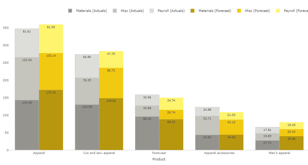
Clustered Stacked Column Chart
Clustered Stacked Column Chart is the perfect visual to compare two different measures across two categories - stacked with one category and clustered by the other.
Note -
This visual is a part of our standard suite.
Get Sample
Download sample .pbix report
Get Trial
Download visual and get trial license
Buy Now
Purchase license
Explore this visual in Live Power BI report
Similar visuals
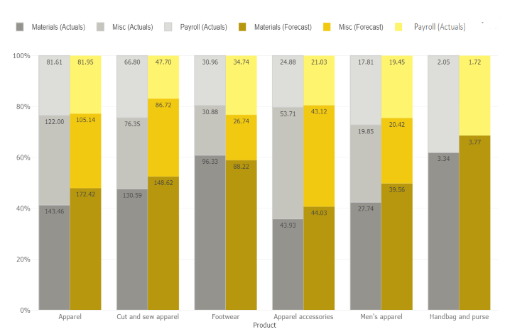
100% Clustered Stacked Column Chart
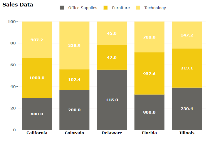
100% Stacked Column Chart with Value Label instead of %
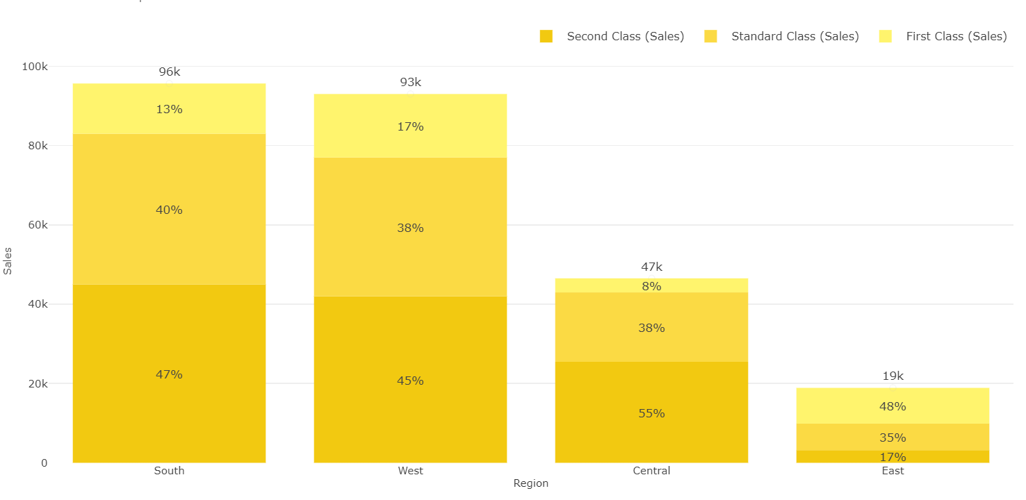
Stacked Column Chart with Percentage and Total in Labels
Download the visual and try in your Power BI environment
Get Trial
Give your email id and get the visual download link with 30 days free trial license. Design your reports with the custom visual file.
Need help?
How to use license
User guide
Version history
Submit an issue
Change this visual to suit your needs
Modify
Modify the visual when you want modifications in the visual features or you want to enhance its functionality.
Need help?
Know about editor
How to modify?
Engage us to design your visual
Submit Details
Let us help you design your custom visual for free. Pay only when you use.
← Gallery