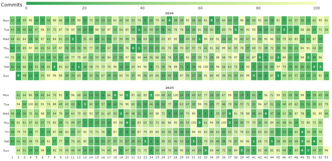
How to Create a GitHub-like Contribution Chart
This post is a guide on how to create a Github contribution chart using Heatmap visual
Read more...
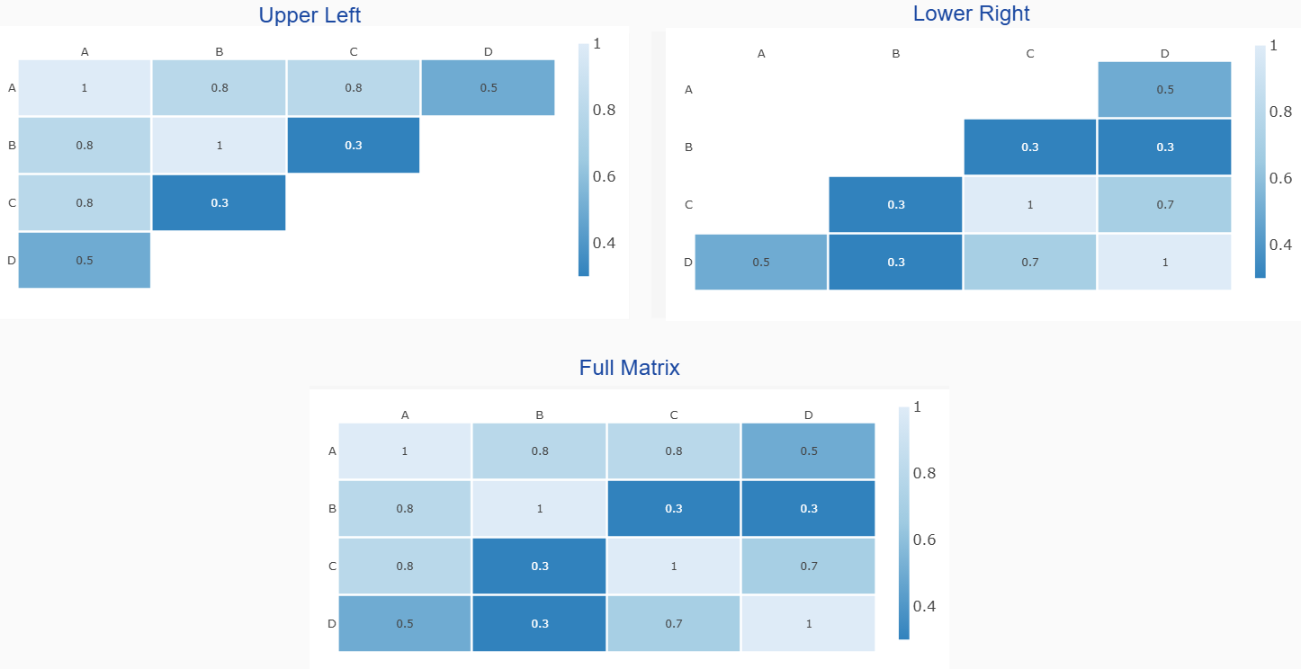
How to Create a Correlation Matrix Heatmap
Correlation heatmap visualizes correlation coefficients among different variables in your dataset. Each cell shows how strongly two variables are related, with color intensity indicating the strength.
Read more...
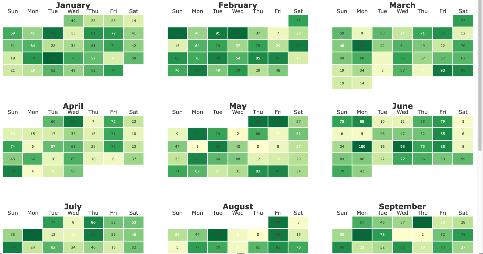
How to Create a Calendar Heatmap
This post is a guide on how to create a Calendar Heatmap visual in PowerBI
Read more...
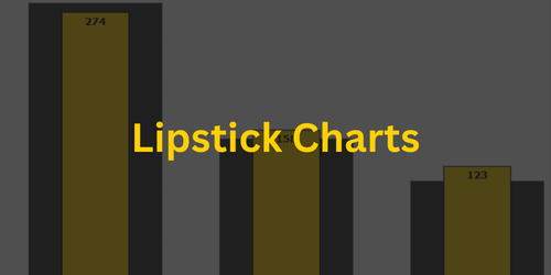
Use PBIVizEdit Lipstick Charts instead of Power BI Native Clustered Charts
Use our Lipstick charts to show comparisons in a cleaner and more intuitive way
Read more...
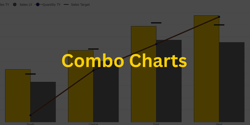
Use PBIVizEdit Dual Axes Combo Charts instead of Power BI Native Line and Clustered Column Chart
Use Combo charts to show upto 4 different metrics
Read more...
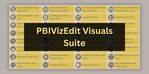
Unlock the Power of Data with Our Suite of 32 Power BI Custom Visuals
Know about PBIVizEdit Custom Visuals Suite
Read more...
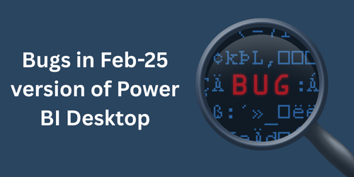
Bugs in Feb-25 version of Power BI Desktop
The February 2025 (latest) release of Power BI Desktop has introduced a few critical bugs that may disrupt your workflow.
Read more...
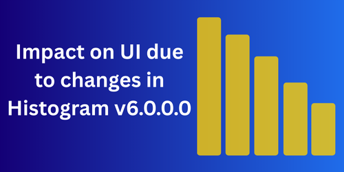
Impact on UI due to changes in Histogram v6.0.0.0
We have enhanced default values of some properties of Histogram in v6.0.0.0. Due to this upgrade to the latest version may introduce some changes in default look and feel of the chart.
Read more...

What is visual id
What is visual ID and from where can you get it?
Read more...

How to use license keys
How should you use license keys with our visuals?
Read more...

How to fix white space in Bubble, Horizontal bullet and Line charts
How to fix white space in Bubble, Horizontal bullet and Line charts when there is huge data mapped.
Read more...
Welcome to PBI VizEdit
PBI VizEdit is Power BI custom visual generation service to build custom visuals without writing code.
Read more...

How PBI VizEdit is different from Charticulator
This post discusses differences between charticulator and PBI VizEdit
Read more...