This visual is deprecated in the favour of Dual Y-Axis Combo Chart visual. To migrate, please check tutorial.
Dot and Clustered Column Chart with Custom Tooltip

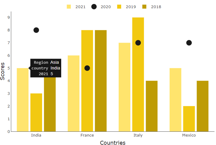
Dot and Clustered Column Chart with Custom Tooltip has a custom tooltip feature that can be added on each data series and can show each dot and bar values separately. Clustered column and dot chart is great for visualising yearly revenue changes and its growth.
Get new offering
This visual is deprecated in favor of more advanced visual. Click the button to go to that offering.
← Gallery
Designers
© Monnel Canada Inc.