Dot and Clustered Column Chart with Custom Tooltip for Power BI
This visual is created from advance visual Dual Y-Axis Combo Chart
Steps to create Dot and Clustered Column Chart from Dual Y-Axis Combo Chart
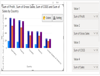
Step 1. Map your data in the fields available
Here ‘Country’ is mapped under Category. ‘Profit’, ‘Gross Sales’, ‘COGS’ and ‘Sales’ mapped under Value 1, Value 2, Value 3 and Value 4 respectively.
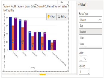
Step 2. Choose the Series Type
Go to Format Visual tab. For ‘Value 1’ make Series Type as Scatter. ‘Value 2’, ‘Value 3’ and ‘Value 4’ make Series Type as Bar.
Note - You can decide the Series Type for each Value mapped based on your requirement.
e.g. - Here for ‘Sales’, ‘Gross Sales ’, ‘COGS’ we have kept Bar and for ‘Profit’ we have kept Scatter.
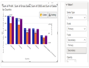
Step 3. Select the Axis Type
In case you want to show the data in secondary axis you can select Secondary under Y axis.
e.g. - for Value 1, we have selected Secondary for Y axis and for Value 2, 3 and 4 Primary for Y axis.
Please note, values which are bound to Primary X axis will appear behind to the values plotted on Secondary X axis.
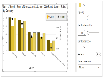
Step 4. Format your visual further
You can further format your visual like color, size, opacity of your series, labels, legend etc under the same tab ‘Format Visual’.