This visual is deprecated in the favour of Advanced Line Chart visual. To migrate, please check tutorial.
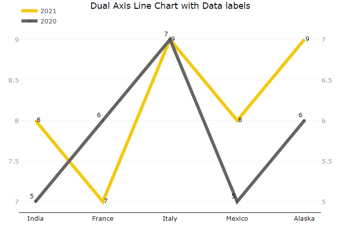
Dual Axis Line Chart with Data Labels

Dual Axis Line Chart with Data Labels is best for comparing sales data or any trend for the two years or two fields simultaneously which requires different axes with custom data labels. This visual overcomes the limitation of Power BI desktop data labels on line charts. We can use any value or measure as data label.
Get new offering
This visual is deprecated in favor of more advanced visual. Click the button to go to that offering.
← Gallery
Designers
© Monnel Canada Inc.