Dual Axis Line Chart with Data Labels for Power BI
This visual is created from advance visual Advanced Line Chart
Steps to create Dual Axis Line Chart with Data Labels from Advanced Line Chart
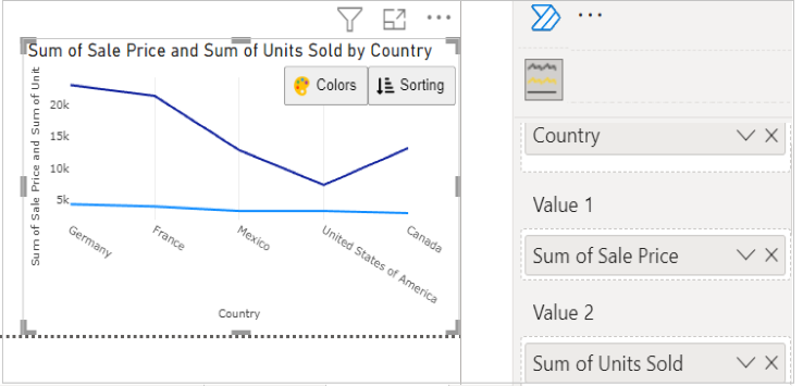
Step 1. Map your data in the fields available
Here ‘Country’ is mapped under Category. ‘Sales price’ and 'Units Sold' are mapped under Value 1 and Value 2 respectively.
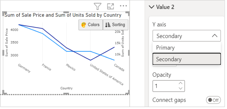
Step 2. Select the Axis Type
Go to Format Visual tab. Under ‘Value 2’ section, select Secondary in Y axis.
e.g. - Here for Sales Price we have selected Primary for Y axis and for Units Sold, we have selected Secondary for Y axis
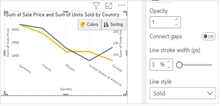
Step 3. Format your visual further
You can further format your visual like color, size, opacity of your series, labels, legend etc under the same tab ‘Format Visual’.
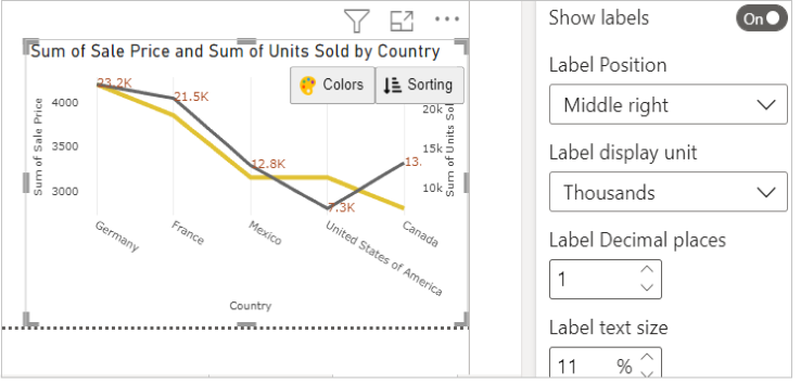
Step 4. Customize data labels
You can format the position, unit, size, colour etc for the data labels.