PBI
Viz
Edit
⋮
Gallery
Editor
Home
How it works
Gallery
Pricing
Docs
Blogs
FAQ
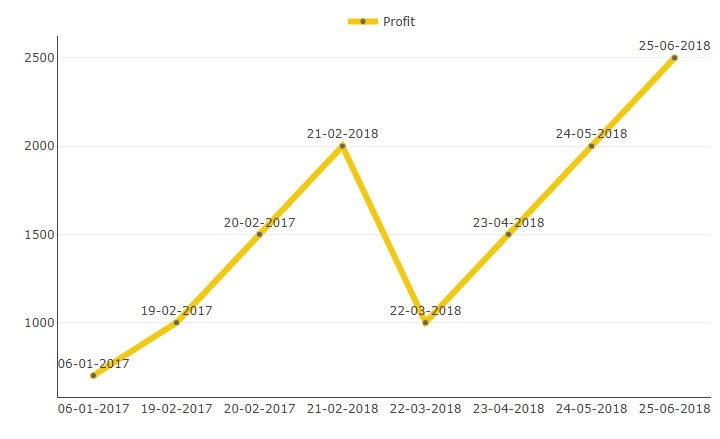
Line Chart with Custom Label Based on Axis
This Power BI custom visual allows you to have custom labels based on fields available on axis .This chart is helpful for users who want to represent growth, increase or decrease in value over time.
Get Trial
Download visual and get trial license
Buy Now
Purchase license
Download the visual and try in your Power BI environment
Get Trial
Give your email id and get the visual download link with 30 days free trial license. Design your reports with the custom visual file.
Need help?
How to use license
User guide
Version history
Submit an issue
Change this visual to suit your needs
Modify
Modify the visual when you want modifications in the visual features or you want to enhance its functionality.
Need help?
Know about editor
How to modify?
Engage us to design your visual
Submit Details
Let us help you design your custom visual for free. Pay only when you use.
← Gallery