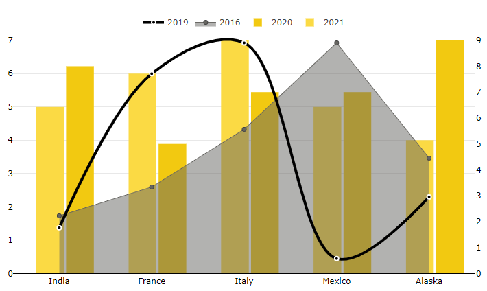
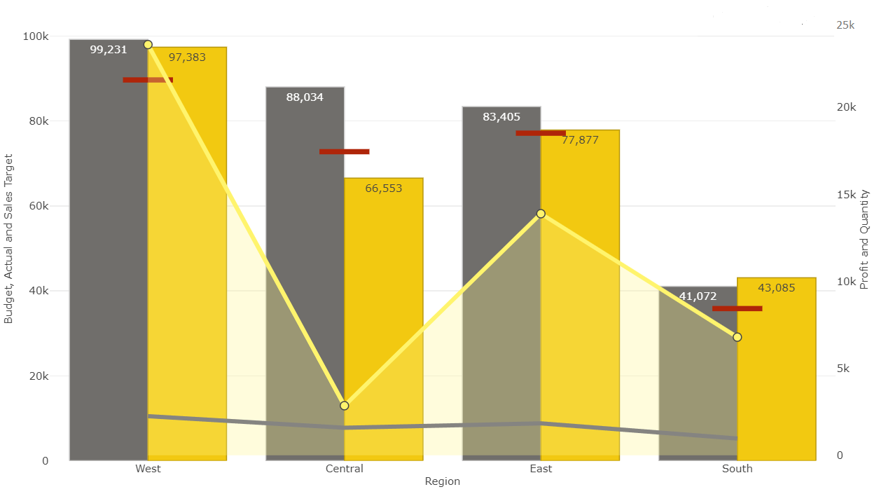
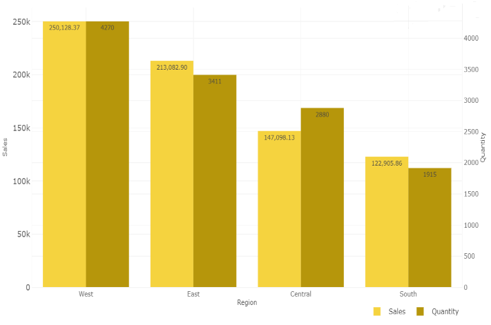
Multiple axes charts are great for visualizing the relationship between two or more variables and are used in in-depth statistical analysis where visual can have 2 axes at the same time. Through this visual we can create column, line, area charts simultaneously.