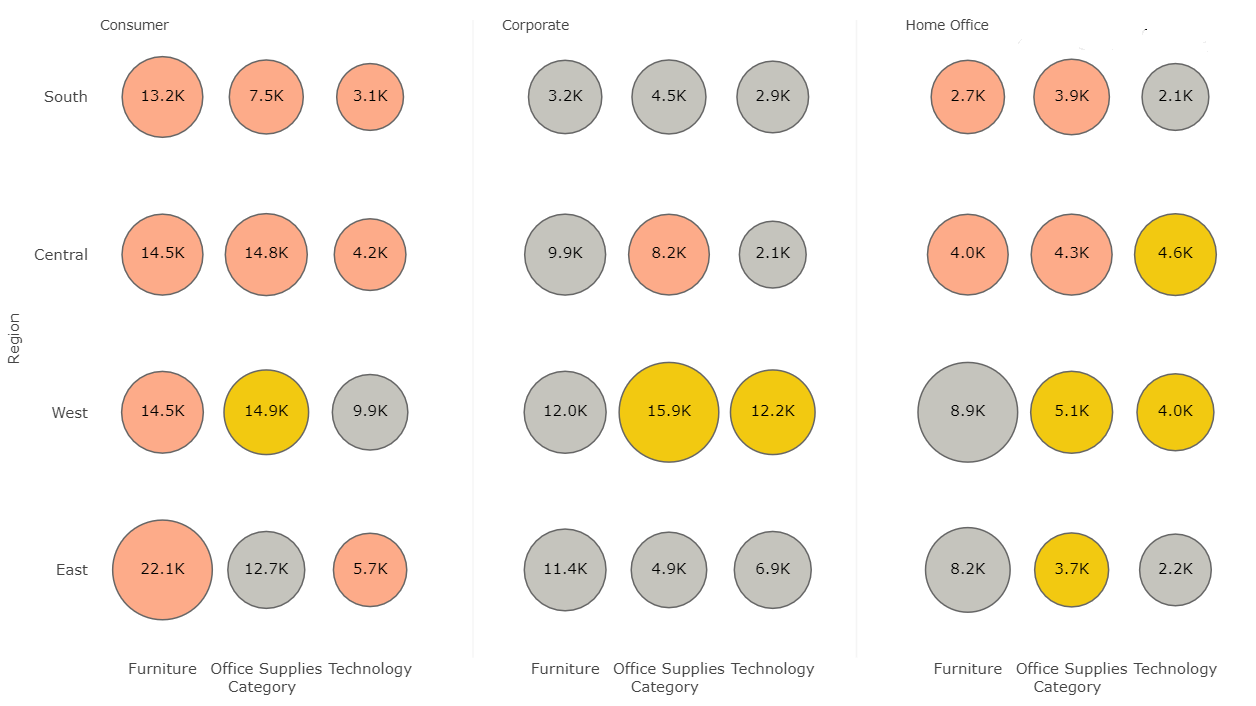
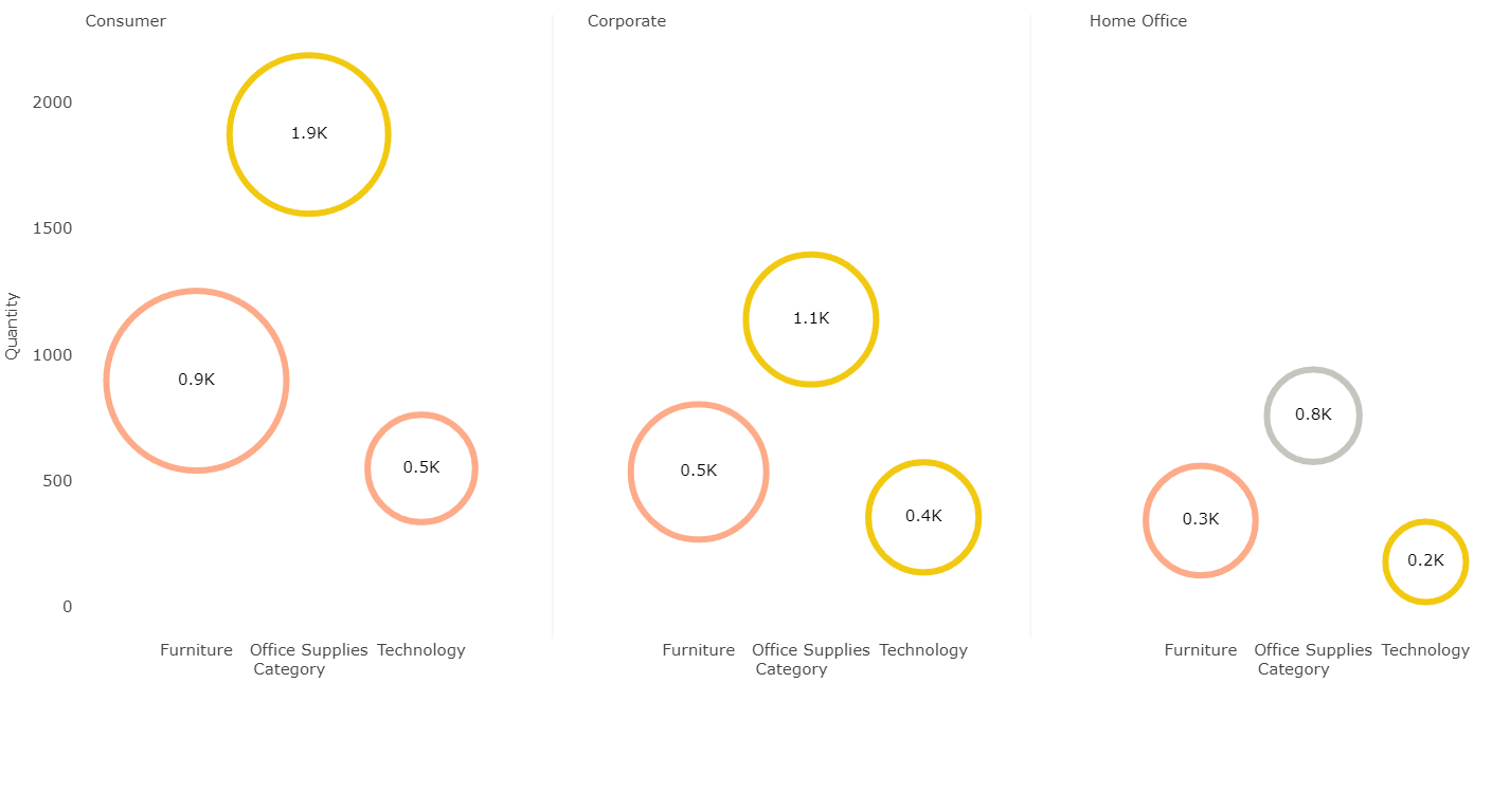
Bubble Chart with Categorical Data overcomes the limitation of Power BI native visual by letting the user have categorical data on both x and y axes. This visual is great when you want to visualise the data in three dimensions - x axis, y axis, and size of marker.