Create Bubble Chart with Categorical Data for Power BI
Step 1 – Get the visual
You can get the visual from our website, Microsoft AppSource or Power BI desktop/web.
a. Website - Go to the visual page and click on ‘Get Trial’ button. You will be redirected to the pricing page where you will provide your email id and click on the ‘Download Visual’ button.
You will receive a mail which will contain the link to download .pbiviz file and a free trial license.

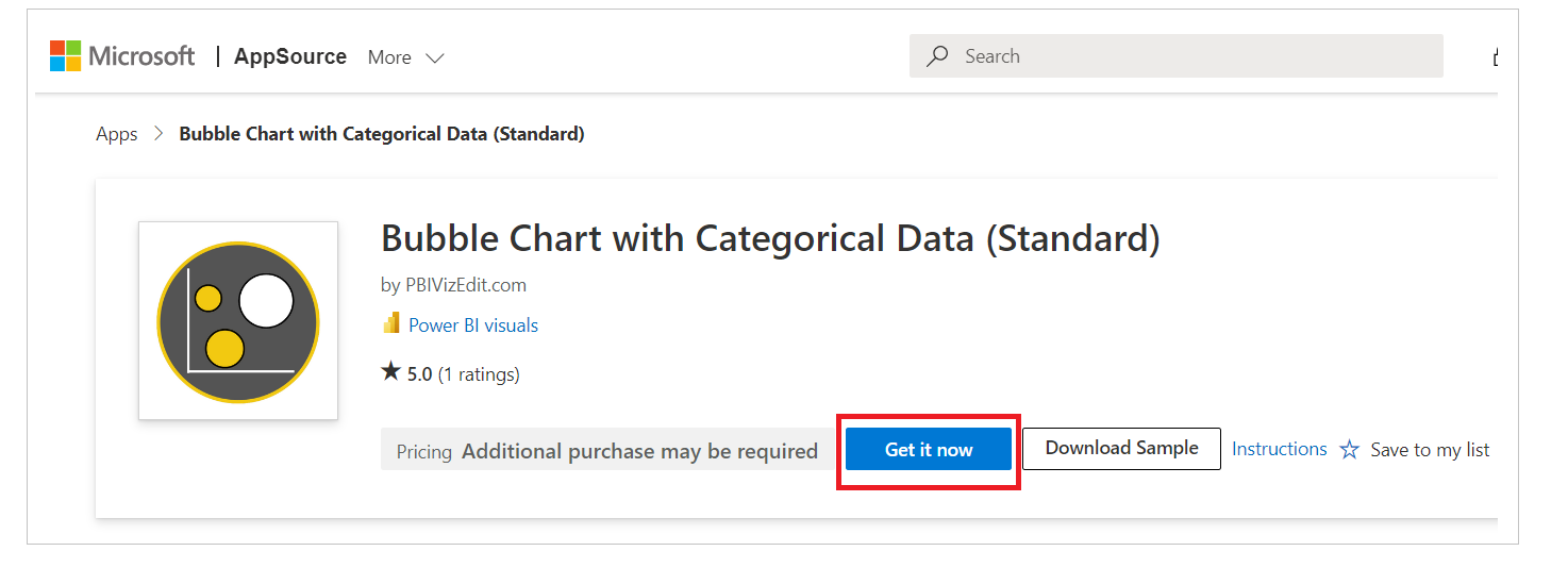
b. Microsoft AppSource – Click on the link and click on ‘Install Free’ button to download the .pbiviz file.
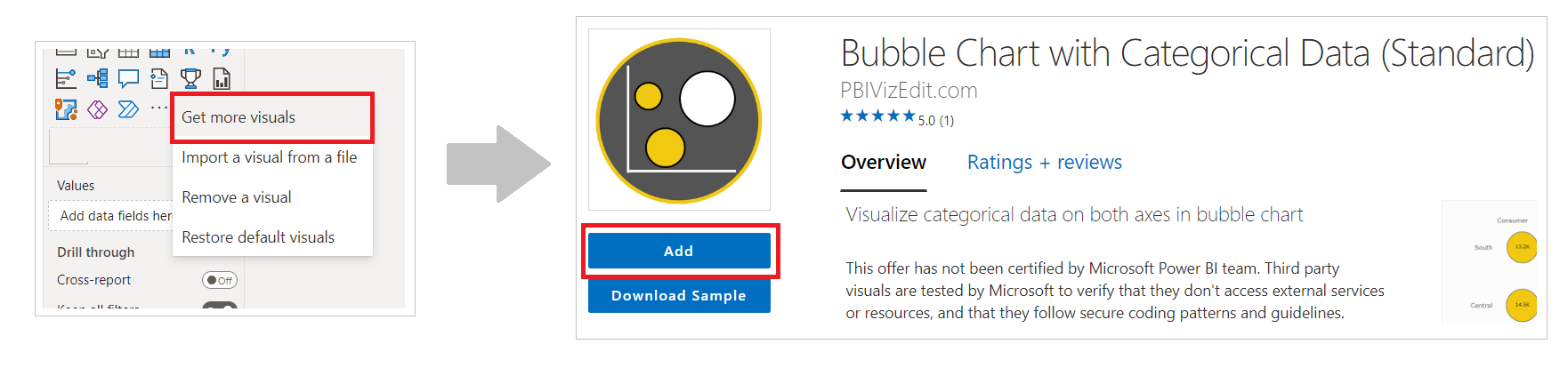
c. Power BI Desktop/Web – From Power BI desktop/web, click on three dots besides native icons and click on Get more visuals. Then type the visual name and click on ‘Add’ button.
Step 2 – Map your data in the fields available
After importing the visual in Power BI, map data in the given fields. Here we have mapped ‘Category’ in X-axis, ‘Region’ in Y-axis, ‘Sales TY’ in Size and ‘Sales TY’ as Label.
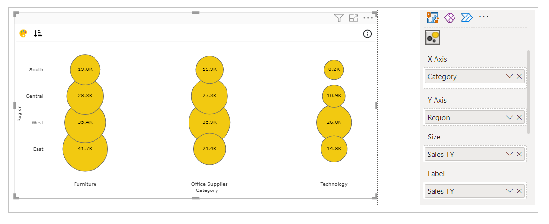
In case you want to show labels or tooltip of some other data in the visual, you can map that data under ‘Label’ or ‘Tooltip’ field respectively.
Step 3 – Format your visual further
a. License Details - If you want to check how your visual works in other Power BI platforms besides Power BI desktop, you have to fill License Details section. To know more about License Details section, click here.
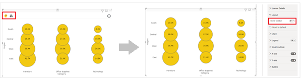
b. Layout Section – In case you don’t want to see the Conditional Color Formatting and Sorting icons present on the top left of the visual. You can switch off the Show Toolbar button.
c. Chart and Legend Section - To know more about these sections, please click the below links
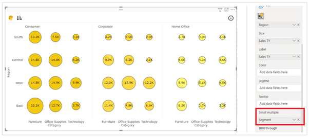
d. Small multiple – If you have already mapped ‘Small multiples’ field with your data based on which you want to split your visuals into small visuals, then this section is used for formatting the small multiple visuals further.
To know more about this section's formatting, go to small multiple section.
e. X/Y Axis – If you want to format the Axes, you can choose the type of Axis, its position, color and much. With Categorical Bubble chart, we can compare two categories simultaneously using one measure for size and another color.
For more details visit Axis section.
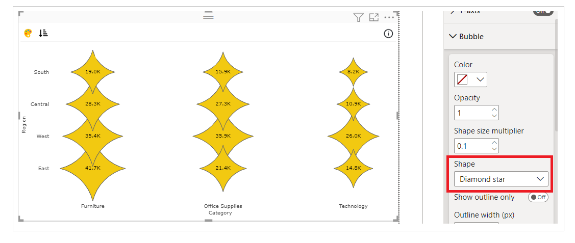
f. Bubble – Under Bubble you have color, opacity/transparency, shape, outline width, label position and display unit etc.
i. Shape - If you want to assign a different shape than circle you can you can choose from 30+ shape from the drop down option.
ii. Show outline only – If you enable this option, you can create bubble chart with border only visual. You can change the color of the border as well as width of the border.
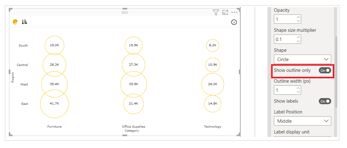
If you want to know more about all the properties available under Bubble section, please refer this page.
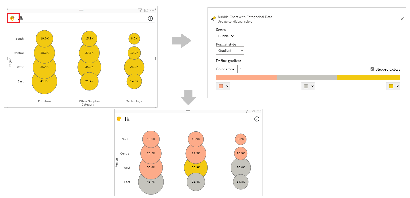
Step 4 – Advance Feature (Conditional Color Formatting and Sorting)
a. Conditional Color Formatting - You can color the column based on data fields, rules or gradient.
You can use Conditional Color Formatting documentation to learn more about this section.
Map the data based on which you want to color them. Click on ‘Conditional Color’ icon on the top left side.
Under Format Style select Gradient. Click on Color stops and you can now change the color of bubble based on minimum and maximum value on the mapped data.
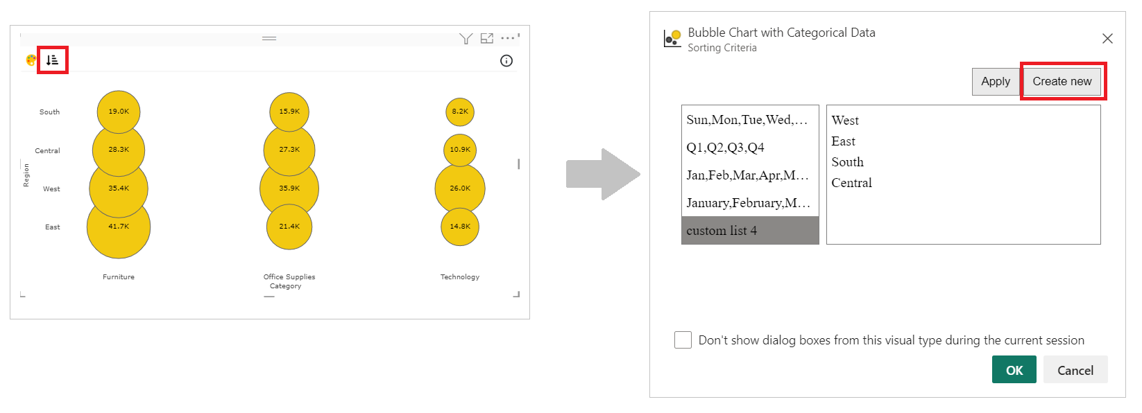
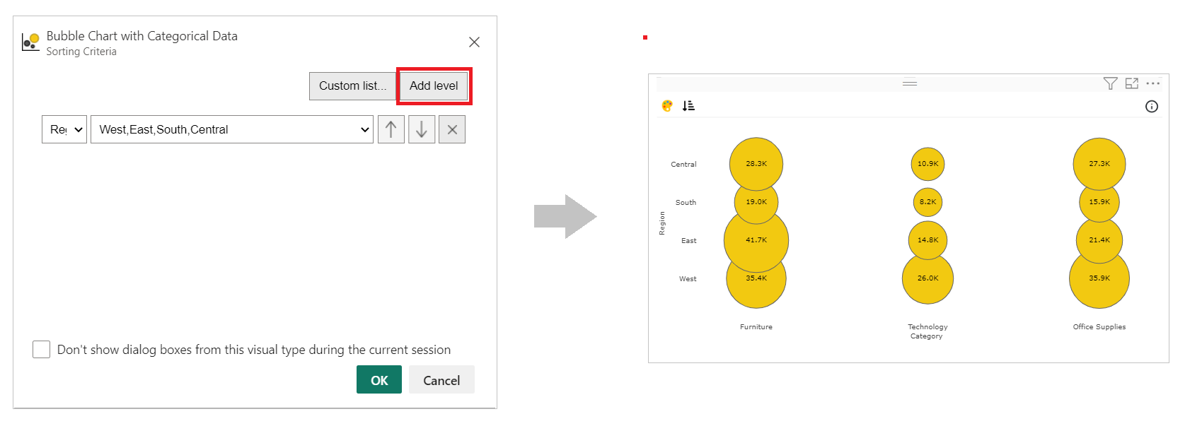
b. Sorting - PBIVizEdit offers great sorting flexibility for all its visuals. Below, we have shown how to create and apply custom sorting based on the fields you choose.
For more details, visit Sorting section.