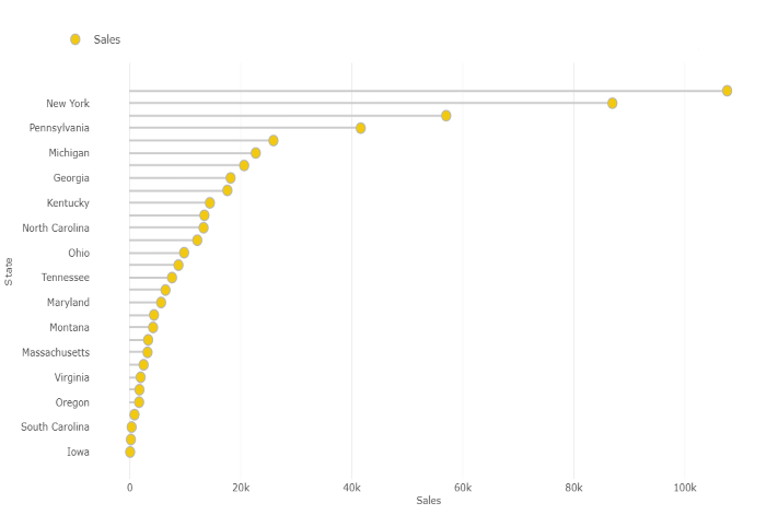
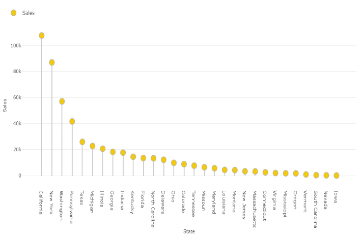
Lollipop Bar Chart gives you a better and attractive visualization as compared to bar chart when you have a large number of similar values or large number of categories. These are great for comparing different items or categories. They are also used for ranking or for showing trends over time.
Note - This visual is a part of our standard suite.