Create Bubble Chart with Border Only for Power BI
This visual is created from visual Bubble Chart with Categorical Data
Steps to create Bubble Chart with Border Only from Bubble Chart with Categorical Data
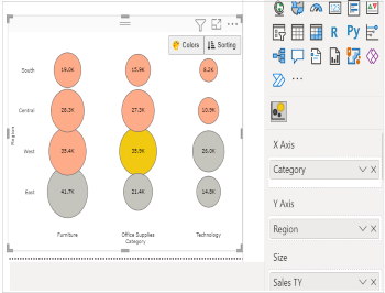
Step 1. Map your data in the fields available
Here ‘Category’ is mapped under X Axis. ‘Region’ and ‘Sales TY’ mapped under Y Axis and Size respectively.
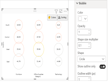
Step 2. Enable 'Show outline only'
Go to Format Visual tab. Under ‘Bubble’ section enable Show outline only
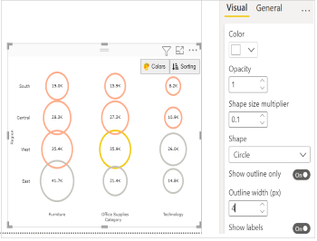
Step 3. Format your visual further
You can further format your visual like color, shape, size ,outline width your bubble, labels, legend etc under the same tab ‘Format Visual’.