Nested Bars
After logging into PBI VizEdit, you will be presented management screen, which displays all the available visuals to you. Now you need to follow these steps:
1. Create New visual
To create a new visual, click on  button. It will present Create new visual screen. Fill the following details:
- Name: Nested Bars
- Description: This is simple visual
- Tags: bars
Click on Create button  button. It will open the visual editor page.
In this page you are going to design your visual.
button. It will open the visual editor page.
In this page you are going to design your visual.
2. Import data
Prepare data either by downloading from Power BI or creating sample data in csv format. Alternatively you can download some sample data from here.
Once you get the data, you need to upload it in PBI VizEdit visual editor by click the
 button. It should be successfully imported to move forward.
To know more about import, see here.
3. Design visual
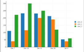
We are going to create 3 nested bars with the data provided. For that,
3.1 Data Attributes
- Add 3 bar series by clicking
 button 3 times in Data Attributes panel. This will add 3 series, Series 0, Series 1 and Series 2 in Data Attributes panel
 - For Series 0, Select Attribute for X Axis, Value A for Y Axis.
- For Series 1, Select Attribute for X Axis, Value B for Y Axis.
- For Series 2, Select Attribute for X Axis, Value C for Y Axis.
Your visual should now show 3 bars:
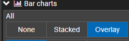
3.2 Visual Attributes
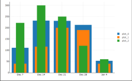
- Bars are grouped, but we want them to be overlaid to each other. For this, expand bar charts and click Overlay button in All section.
- Provide width for each plot (plot_0, plot_1 and plot_2) in the Bar sub section. These values may be 0.8, 0.6 and 0.4 respectively.
You may wish to change the visual appearance as per your choice. Feel free to experiment with different visual attributes.
4. Export Visual
Once you are satisfied with the visual appearance, you may wish to generate Power BI visual file. This can be done by launching Export Visual dialog. This can be done by clicking  button.
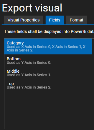
- In the Export Visual dialog, in the fields Tab, change the display name for different fields to suite your needs. In our case, we have given as follows:
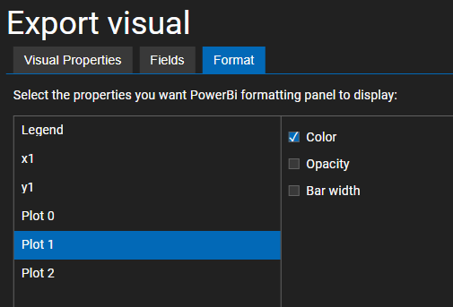
- For each plot, you may wish to change Color in Power BI. To allow this, you need to check Color property for each Plot in Format tab:
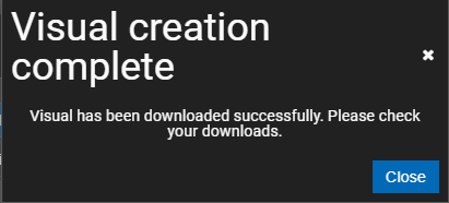
Now it is the time to export the visual. Click on 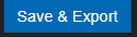 button. This will generate code on server, compile a new visual file and download it in your downloads. This process may take some time in the range of 1-5 minutes.