Create Dual Y-Axis Combo Chart for Power BI
Step 1 – Get the visual
You can get the visual from our website, Microsoft AppSource or Power BI desktop/web.
a. Website - Go to the visual page and click on ‘Get Trial’ button. You will be redirected to the pricing page where you will provide your email id and click on the ‘Download Visual’ button.
You will receive a mail which will contain the link to download .pbiviz file and a free trial license.

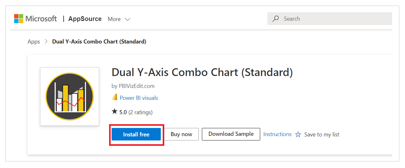
b. Microsoft AppSource – Click on the link and click on ‘Install Free’ button to download the .pbiviz file.
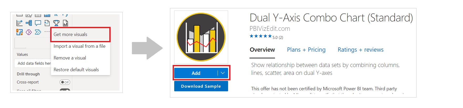
c. Power BI Desktop/Web – From Power BI desktop/web, click on three dots besides native icons and click on Get more visuals. Then type the visual name and click on ‘Add’ button.
Step 2 – Map your data in the fields available
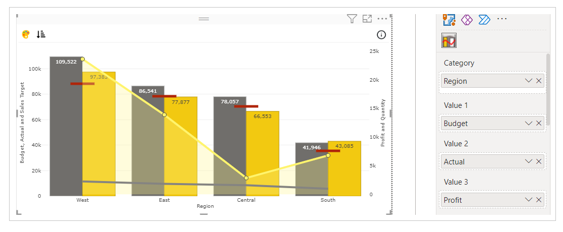
After importing the visual in Power BI, map data in the given fields. Here we have mapped ‘Region’ in Category, ‘Budget’ in Value 1, ‘Actual’ in Value 2, ‘Profit’ in Value 3, ‘Quantity’ in Value 4 and ‘Sales Target’ in Value 5.
In case you want to show legend or tooltip of some other data in the visual, you can map that data under ‘Legend’ or ‘Tooltip’ field respectively.
Step 3 – Format your visual further
a. License Details - If you want to check how your visual works in other Power BI platforms besides Power BI desktop, you have to fill License Details section.
To know more about License Details section, click here.
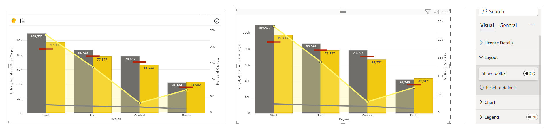
b. Layout Section – In case you don’t want to see the Conditional Color Formatting and Sorting icons present on the top left of the visual. You can switch off the Show Toolbar button.
c. Chart and Legend Section - To know more about these sections, please click the below links
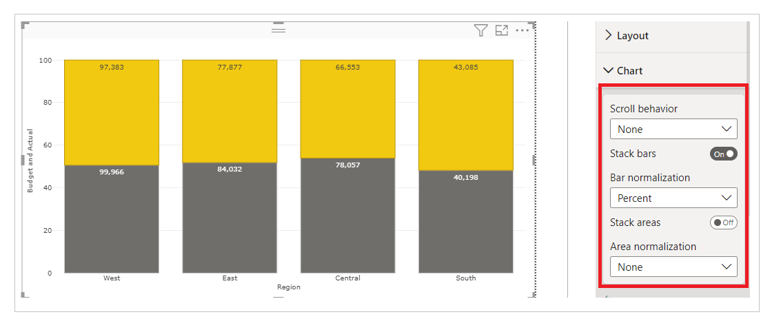
i. Stack column - Enabling this option, converts your clustered columns into stacked columns, We have bar normalization by selecting Percent or Fraction from drop-down. Fraction option will show fraction values (0-1) in the axis and Percent option will show percentage values (0-100) in the axis.
we can also do the same for area chart.
d. Small multiple – If you have already mapped ‘Small multiples’ field with your data based on which you want to split your visuals into small visuals, then this section is used for formatting the small multiple visuals further.
To know more about this section's formatting, go to small multiple section.
e. X/Y Axis - You can format the X and Y Axis under these sections. You can choose the type and position of the axis, axis color, axis label formatting and many more.
For more details visit Axis documentation.
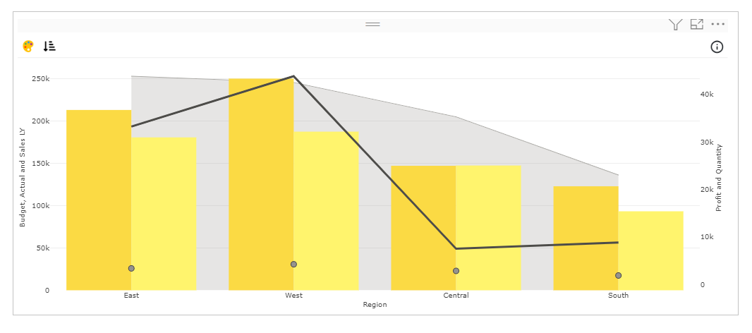
f. Value - Under Value section, you can select the series type, assign primary or secondary to X axis and Y axis, color of the value, opacity/transparency, bar width and border. Along with that you have some additional features. Here we have the option to assign Series Type as Bar, Scatter, Line and Area for every individual value. You can create a lot of different chart variants with this visual.
g. Variations of Dual Y Combo Chart - Here we have the option to assign Series Type as Bar, Scatter, Line and Area for every individual value. You can create lot of different charts variants with this visual. Here we have all series type except pie.
i. Column Line Area Scatter Combo - In Format section under the Value tab, if we change series type in Value 1, 2, 3, 4, and 5 to Area, Bar, Bar, Line and Scatter respectively, we will get a Column Line Area Scatter Combo Chart.In case you want to show the data in secondary axis you can select Secondary under X axis.
e.g. - For Value 1, we have selected Primary for the X axis; for Value 2, Secondary for the X axis; for Value 3, Secondary for the X axis; for Value 4, Secondary for the Y and X axis; and for Value 5, Secondary for the Y and X axis.
Note - Values that are bound to Primary Y axis will appear behind the values plotted on Secondary Y axis.
ii. Line Column Combo Chart – In Format section under Value tab, if we change series type in Value 1 and 2 to Bar and Value 3 and 4 to Line, we will get Line Column Combo Chart.

Note - Here we kept Value 1 and 2, X axis and Y axis as Primary Value; Value 3 and 4, X axis and Y axis as Primary and Secondary respectively. You can create a lot other variations such as Column Dot Combo, Column Line Area Combo etc.
Based on your series type if you want to know more about it, please check here.
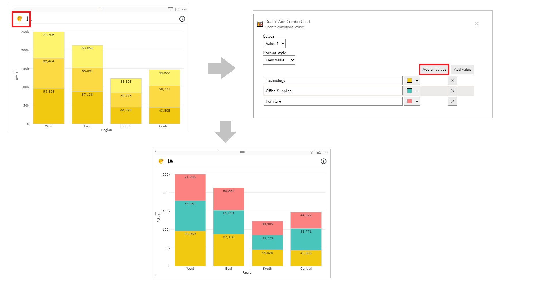
Step 4 – Advance Feature (Conditional Color Formatting and Sorting)
a. Conditional Color Formatting - You can color the column based on data fields or rules. You may learn more about conditional color formatting by visiting the Conditional Color Formatting section.
Conditional coloring in this visual is based on legend. Map the data based on which you want to color them. Click on ‘Conditional Color’ icon on the top left side.
Under Format Style select Field value. Click on Add all values and you can now change the color of column based on the mapped data.
Note - gradient coloring is not available in this visual currently. Coloring based on fields and rules are possible.
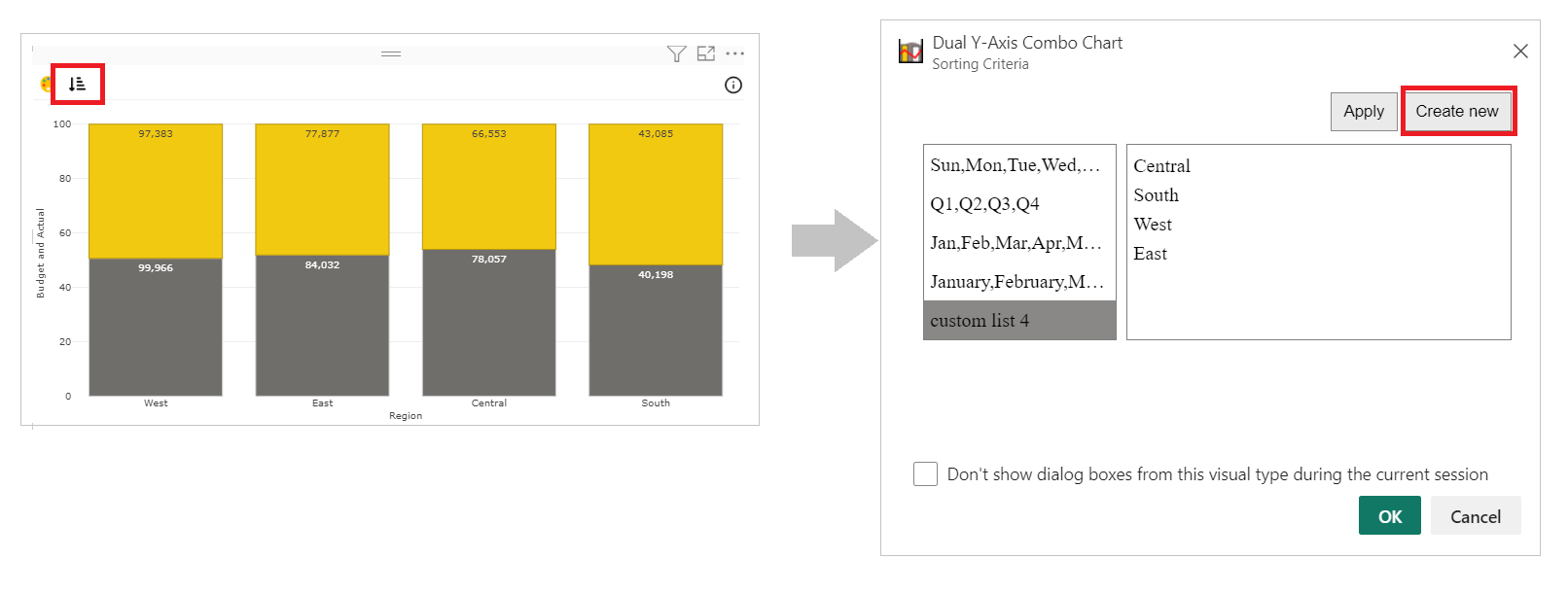
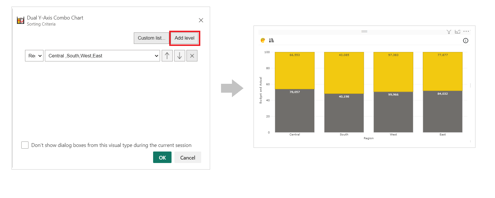
b. Sorting - PBIVizEdit offers great sorting flexibility for all its visuals. Below, we have shown how to create and apply custom sorting based on the fields you choose.
For more details, visit Sorting section.