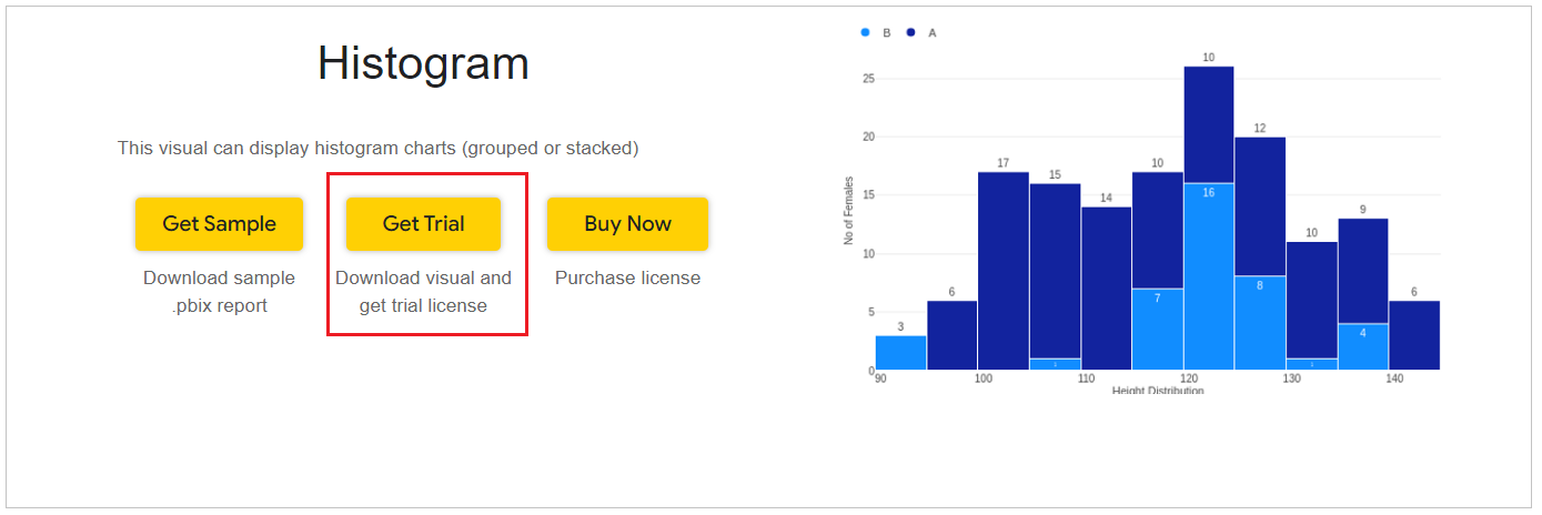
Create Histogram Chart for Power BI
FAQs :
- How to handle summarizing of repeated values in Histogram?
- How to create custom bins?
- What to do when Histogram does not show all the data?
Step 1 – Get the visual
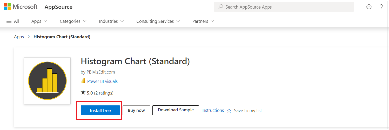
You can get the visual from our website, Microsoft AppSource or Power BI desktop/web.
a. Website - Go to the visual page and click on ‘Get Trial’ button. You will be redirected to the pricing page where you will provide your email id and click on the ‘Download Visual’ button.
You will receive a mail which will contain the link to download .pbiviz file and a free trial license.
b. Microsoft AppSource – Click on the link and click on ‘Install free’ button to download the .pbiviz file.
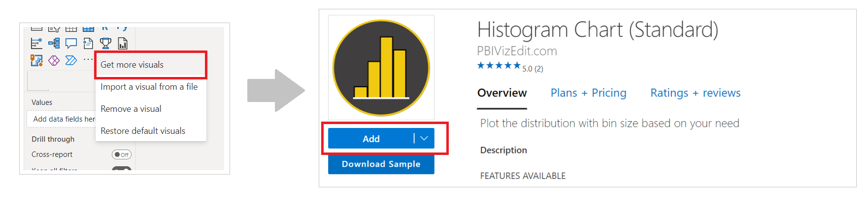
c. Power BI Desktop/Web – From Power BI desktop/web, click on three dots besides native icons and click on Get more visuals. Then type the visual name and click on ‘Add’ button.
Step 2 – Map your data in the fields available
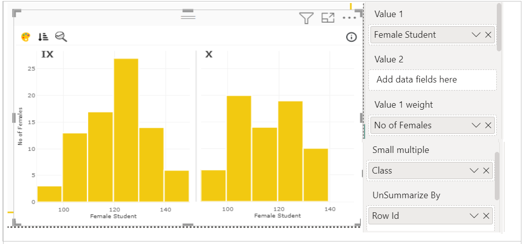
After importing the visual in Power BI, map data in the given fields.
Value 1 and Value 2 are the main numerical fields which are used to show data distribution.
UnSummarize By: Any visual in Power BI data gets summarized data. You can do "Don't Summarize" option available in drop down of the measure once mapped under Value 1 or 2 fields. But at times it doesn't work properly, hence we have provided this field to unsummarize the data.
Value 1 weight and Value 2 weight fields define how Value 1 and Value 2 values are treated.
Here we have mapped ‘Female Student Height’ in Value 1, ‘No. of Females’ in Value 1 weight, ‘Class’ in Small Multiple and ‘Row ID’ in UnSummarize By fields.
Note - Legend, Value 1 and Value 1 Weight fields are not mapped here. They are available in the visual and can be used whenever needed.
Step 3 – Format your visual further
a. License Details - If you want to check how your visual works in other Power BI platforms besides Power BI desktop, you have to fill License Details section. To know more about License Details section, click here.
b. Layout Section – In case you don’t want to see the Conditional Color Formatting, Sorting and Analytics pane icons present on the top left of the visual. You can switch off the Show Toolbar button.

c. Fetch more data – In case you have lots of rows (>30000), you need to enable Fetch more data and give the number of rows that you expect in return.
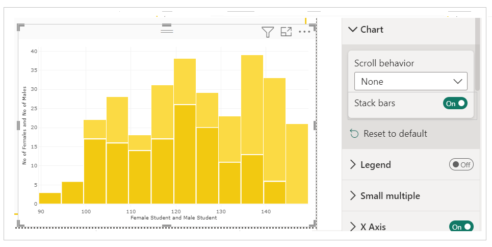
d. Chart Section - This section has the option to stack the columns if two fields Value 1 and value 2 are mapped.
Value 1 and Value 2 fields are given so that you can have two histograms in the same visual. The histogram bars will appear side by side (for comparison) when 'Stack bars' option is disabled. The bars will appear stacked (to display part of whole) when 'Stack bars' is enabled.
 To know more about this section, click the link below
e. Legend Section - To know more about this section,please click the link below
f. Small multiple – If you have already mapped ‘Small multiples’ field with your data based on which you want to split your visuals into small visuals, then this section is used for formatting the small multiple visuals further.
To know more about this section's formatting, go to small multiple section.
g. X/Y Axis – If you want to format the Axes, you can choose the type of Axis, its position, color and much.
For more details visit Axis section.
h. Field 1/Field 2 – Under these sections you can change the properties of the columns. You have Flip, Color, Transparency, Bar border width, Border color, Patterns etc.
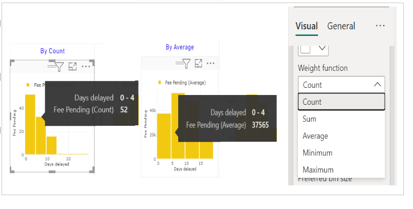
i. Weight function - Determine how the weight is taken into account while calculating the bar value. You can choose from Count, Sum, Average, Minimum and Maximum.
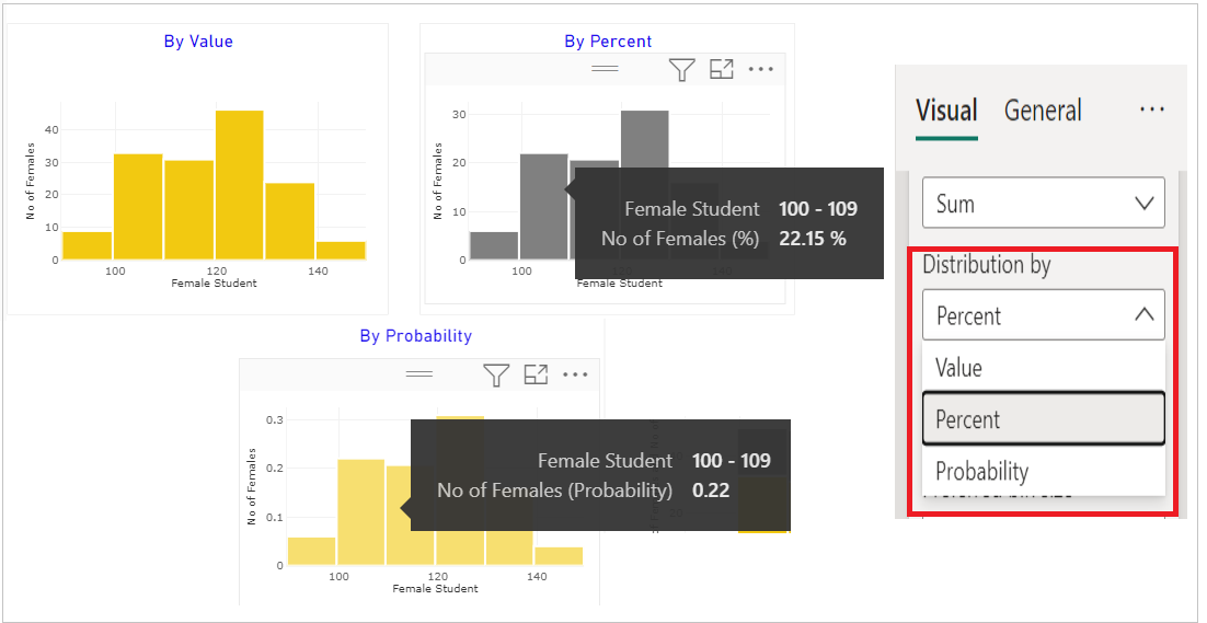
ii. Distribution by – Determine how you want to show the value in the graph. You can choose from Value, Percent and Probability.
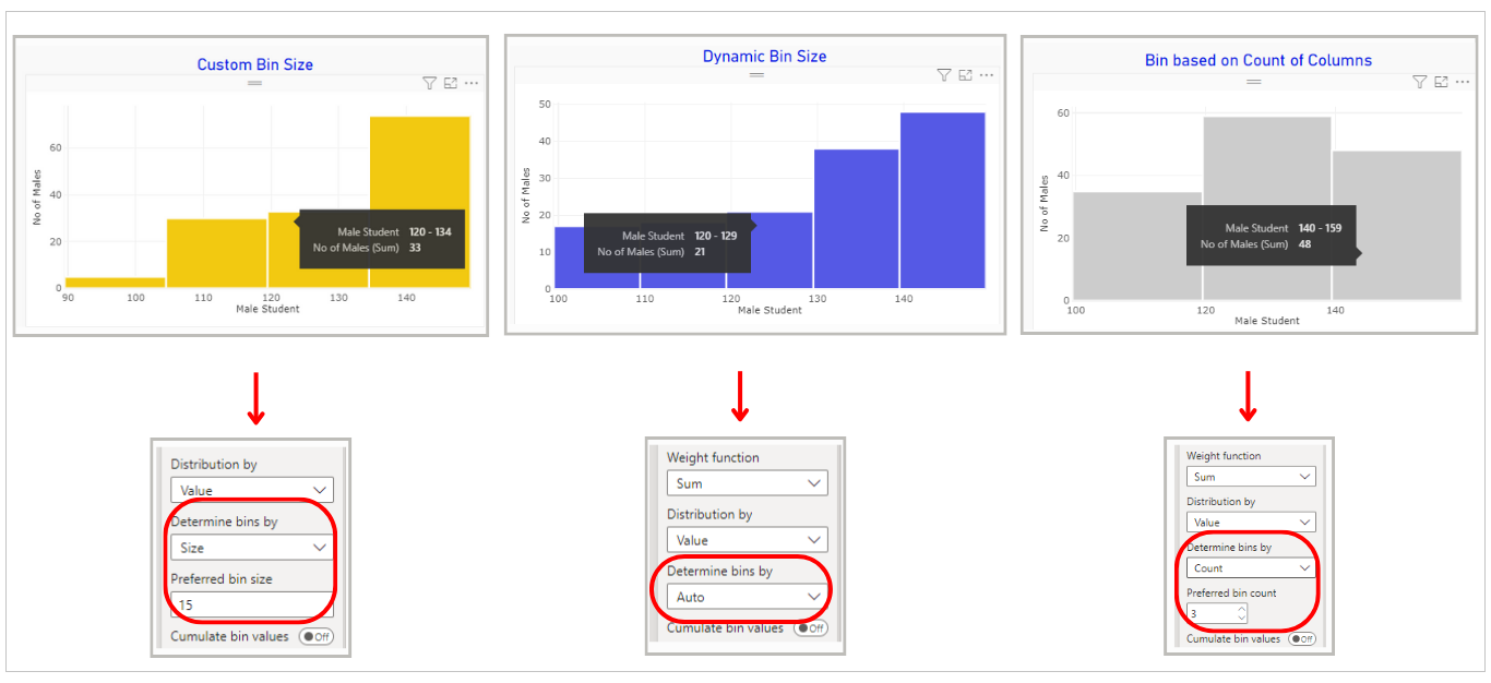
iii. Determine bins by – Use Bin Customization formatting to set bin sizes based on your needs. You can choose from Auto (for dynamic bin size setting), Size (here you can set your preferred bin size) and Count (here you can set how many total bins you want).
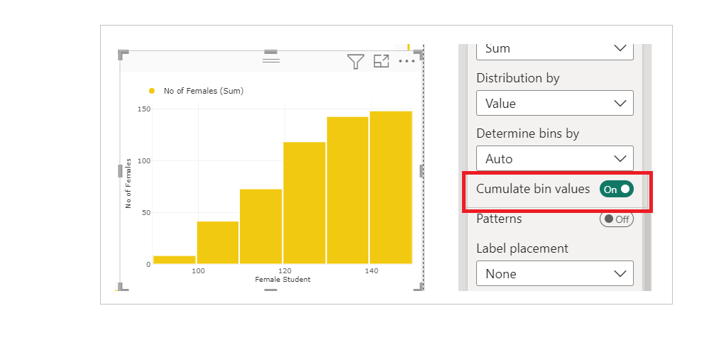
iv. Cumulate bin values – If you enable this option, current bin value will be added to the previous bin value when columns are drawn.
v. Label placement – By default the labels are 'Off' in this visual. To enable the labels, change the value of 'Label placement' from None to other options available.
If you want to know more about all the properties available under Column section, please refer this page.
Step 4 – Advance Feature (Conditional Color Formatting, Analytics Pane and Sorting)
a. Conditional Color Formatting - You can color the Histogram columns based on data fields and/or rules.
Note -Conditional coloring in Histogram is based on Legend.
You can use Conditional Color Formatting documentation to learn more about this section.
b. Sorting - PBIVizEdit offers great sorting flexibility for all its visuals.
For more details, visit Sorting section.
c. Analytics Pane - With Analytics Pane, you can add Reference lines and Reference bands to the visual. The icon is present on top left section of the visual along with conditional formatting and sorting icons.
Show Reference line and Reference bands based on different aggregations and constant values. All these features work on Small Multiples as well.