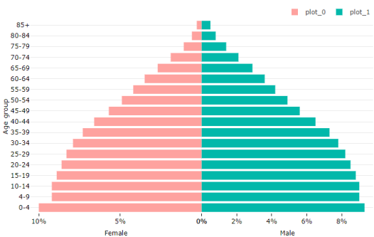
Population pyramid
Population pyramid chart is a divergence bar chart which is created with the support of multiple axis. here is the screenshot of what we are going to build:
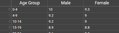
This is the data which is used to create the above chart. You can download it from here.
As you can see, this chart has 3 axis:
- Vertical Y axis (y1), showing Age group
- Horizontal X axis (x1), showing Male population percentage
- Horizontal X axis (x2), showing Female population percentage
Follow these steps to create this chart:
- Import sample data given here.
- Create two bar series:
- Series 0: X Axis=Male, Y Axis=Age Group
- Series 1: X Axis=Female, Y Axis=Age Group
- Ensure you have 3 axis:
- y1: Vertical axis
- x1: Horizontal axis
- x2: Horizontal axis
- Change following properties for x1:
- Show axis line: false
- Lower bound: 0
- Upper bound: 50 (means the axis utilized the area of chart starting from 0 to 50% horizontally)
- Anchored with: y1 (y1 is the companion opposite axis)
- Flip: true (we need to show the bars from right to left instead of left to right)
- Title: Female
- Change following properties for x2:
- Show axis line: false
- Lower bound: 50
- Upper bound: 100
- Anchored with: y1 (y1 is the companion opposite axis)
- Title: Male
- Change following properties for y1:
- Show axis line: false
- Lower bound: 0
- Upper bound: 100
- Anchored with: x1 (companion opposite axis. If you make x2 companion axis, the y1 axis will appear in the middle of chart)
- Title: Age group The above steps will setup the axis. Now, we need to bind the plots with different axis.
- Change following properties for plot_0:
- X axis: x1
- Y axis: y1 (plot this chart on x1, y1 axis)
- Bar: click on Bar
- Change following properties for plot_1:
- X axis: x2
- Y axis: y1 (plot this chart on x2, y1 axis)
- Bar: click on Bar
You should be able to see you chart. You may also want to tweak the legend, margins, plot colors etc. Please do that as per your taste.
Once you are satisfied, export the Power BI visual.