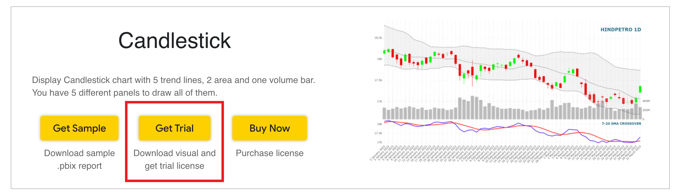
Create Candlestick Chart for Power BI
Step 1 – Get the visual
You can get the visual from our website, Microsoft AppSource or Power BI desktop/web.
a. Website - Go to the visual page and click on ‘Get Trial’ button. You will be redirected to the pricing page where you will provide your email id and click on the ‘Download Visual’ button.
You will receive a mail which will contain the link to download .pbiviz file and a free trial license.
Step 2 – Map your data in the fields available
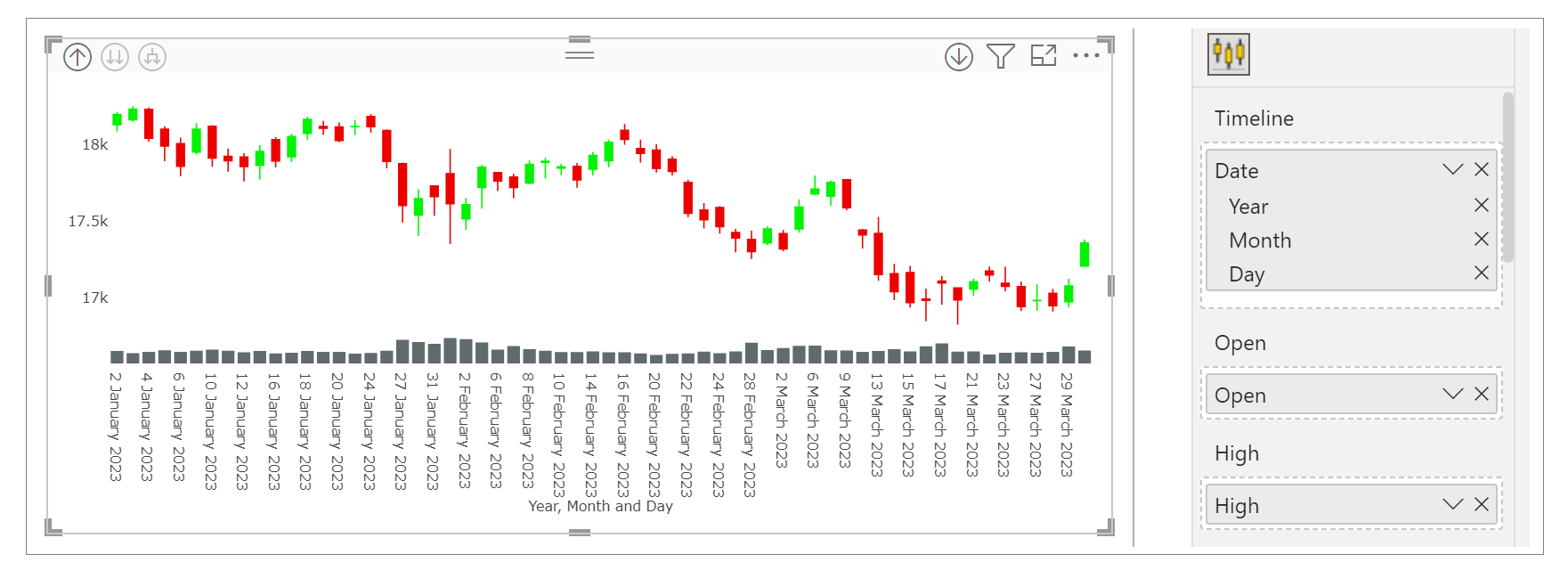
After importing the visual in Power BI, map data in the given fields.
Here, we have mapped ‘Date’ in Timeline, ‘Sum of Open’ in Open, ‘Sum of High’ in High, ‘Sum of Low’ in Low, 'Sum of Close' in Close and 'Sum of Volume' in Volume.
Select date hierarchy and expand all down in the hierarchy to the lowest level of data.
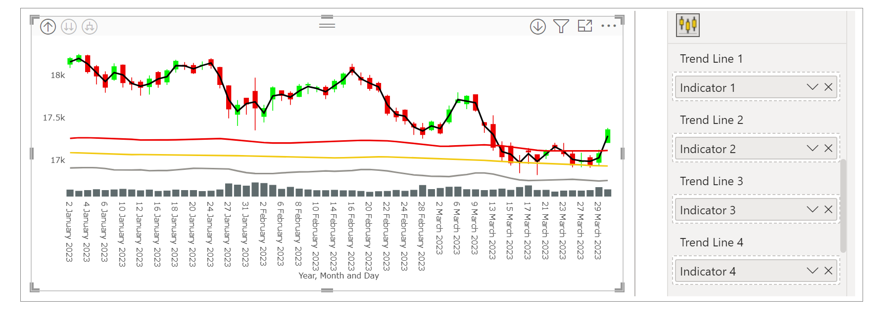
Up to five trend lines, two area and tooltip can be mapped as well. We have mapped four trend lines below.
Step 3 – Format your visual further
a. License Details - If you want to check how your visual works in other Power BI platforms besides Power BI desktop, you have to fill License Details section.
To know more about License Details section, click here.
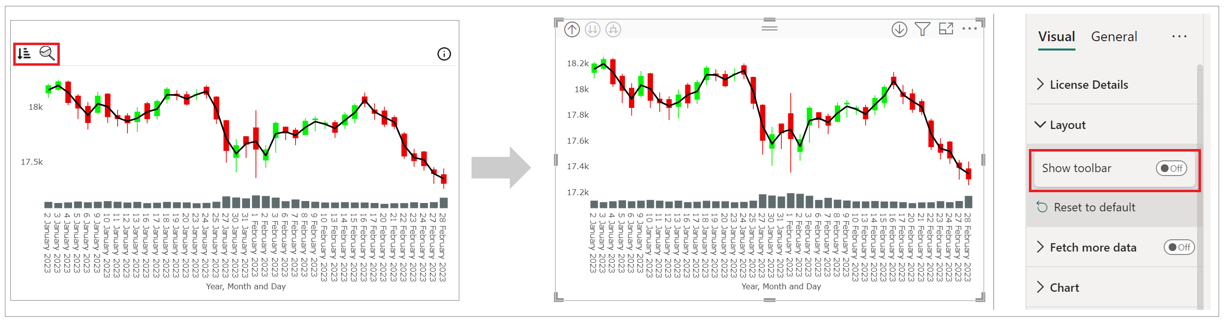
b. Layout Section – In case you don’t want to see the Sorting and Analytics icons present on the top left of the visual. You can switch off the Show Toolbar button.
c. Chart and Legend Section - To know more about these sections, please click the below links
d. X/Y Axis – You can format the X and Y Axis under these sections. You can choose the type of the axis, axis color, axis label formatting and many more.
For more details visit Axis section.
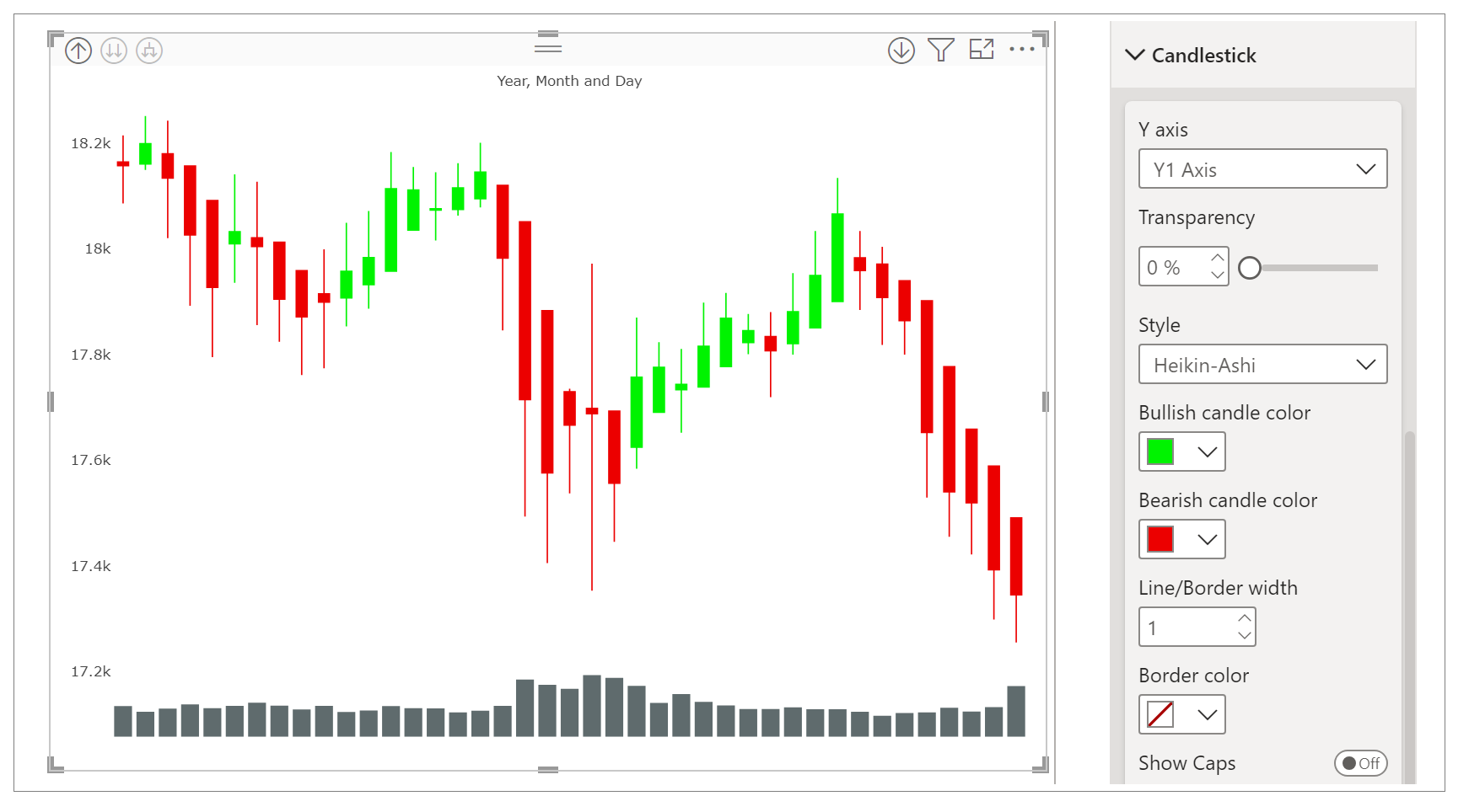
e. Candlestick Section – Under Candlestick section, you have all the properties through which you can configure the candlestick like transparency, style, bullish and bearish candle color, line/border width and show/hide line, border color and show/hide caps.
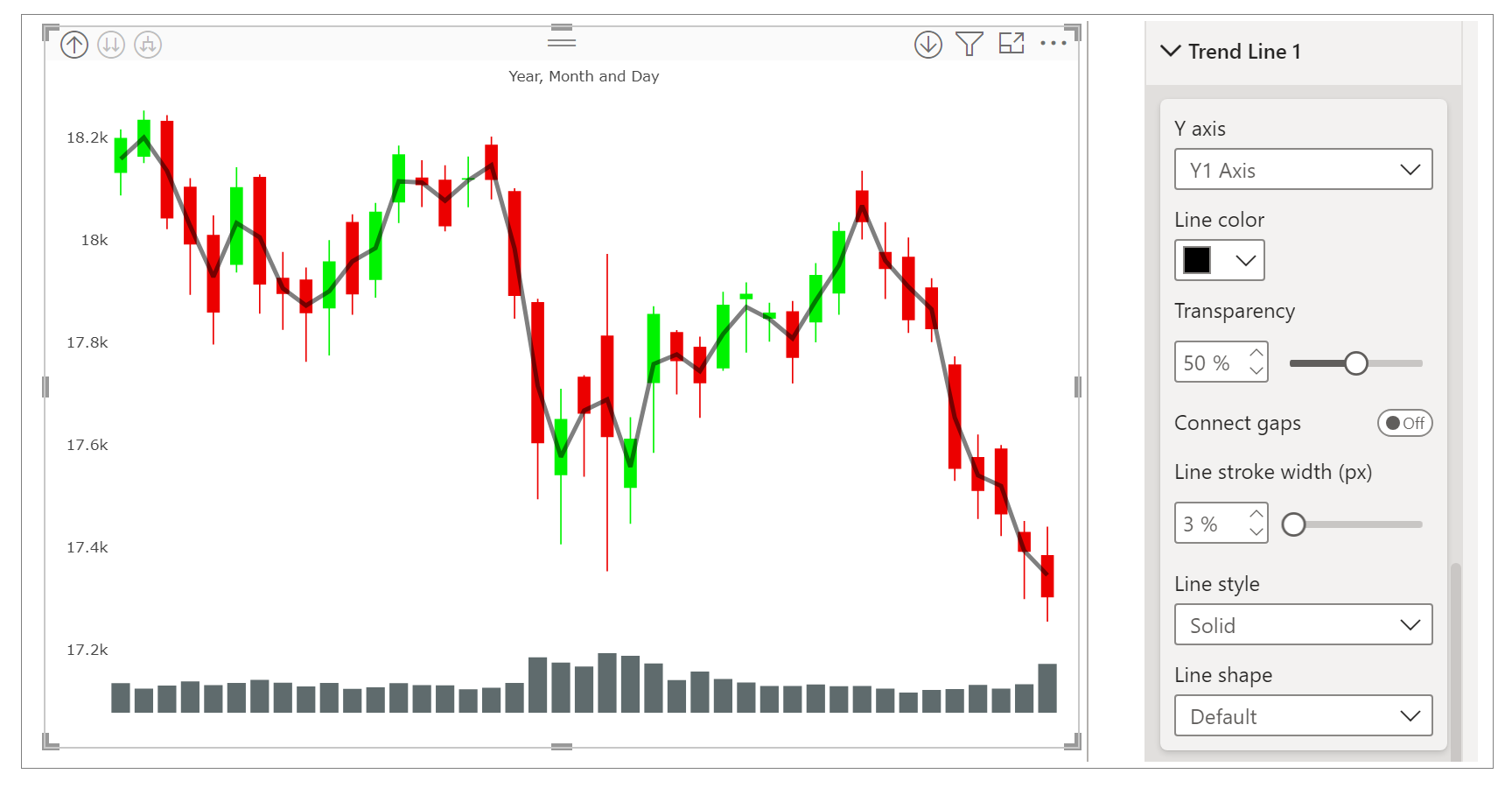
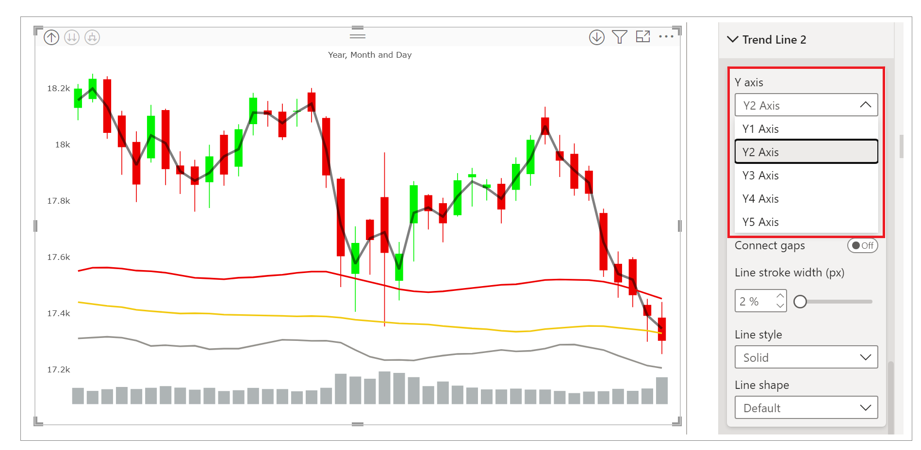
f. Trend Line Properties - You can customize the properties of trend line like y axis, line color, transparency, line style, shape, etc.
Note - You can modify properties of every trend lines individually.
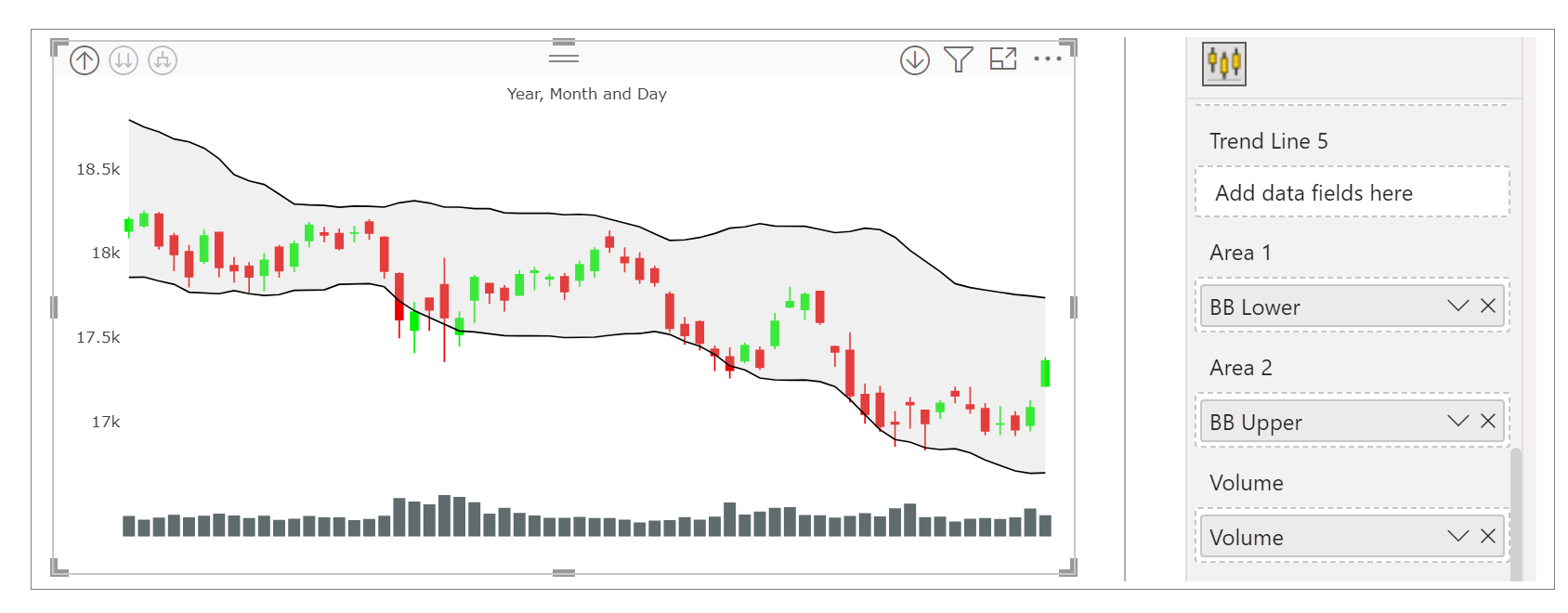
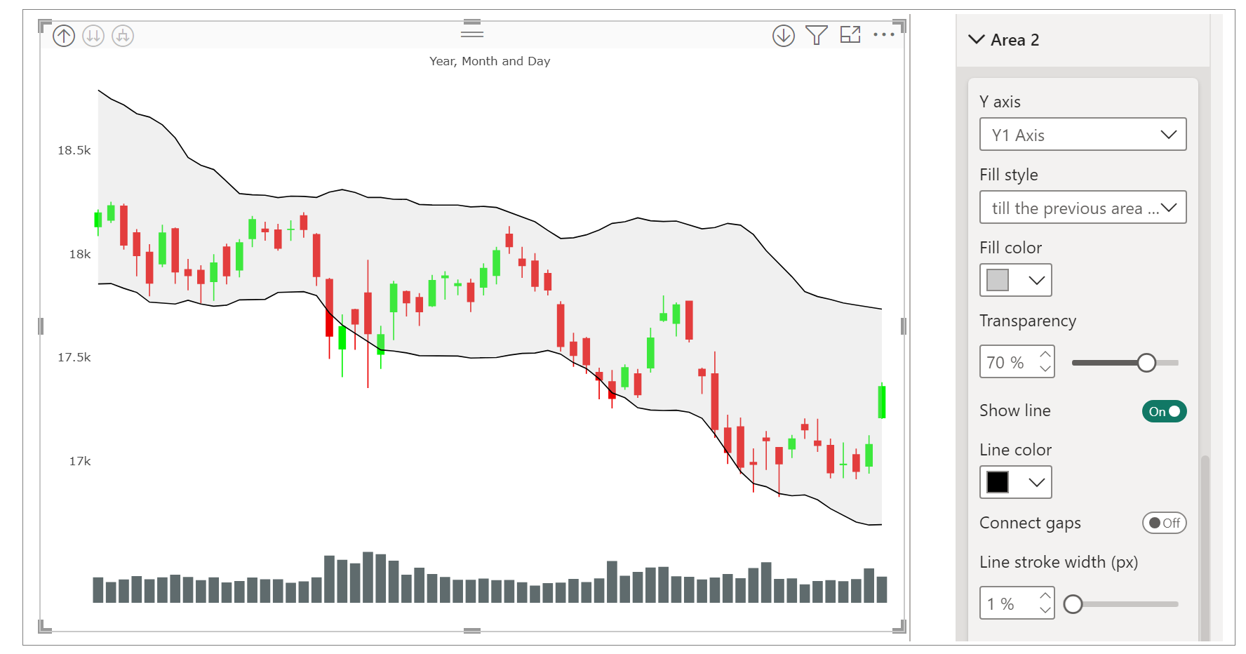
g. Area Properties - You can customize the properties of area like y axis, fill style, fill color, transparency, show/hide line and its properties.
Using properties of area, bollinger bands can be created by the following steps:
a. Map the data to area1 and area2.
b. Under format your visual, select the desired area.
c. Under fill style, there are options to fill the area.
d. Fill the area till axis, till the previous area chart or till area enclosed by self.
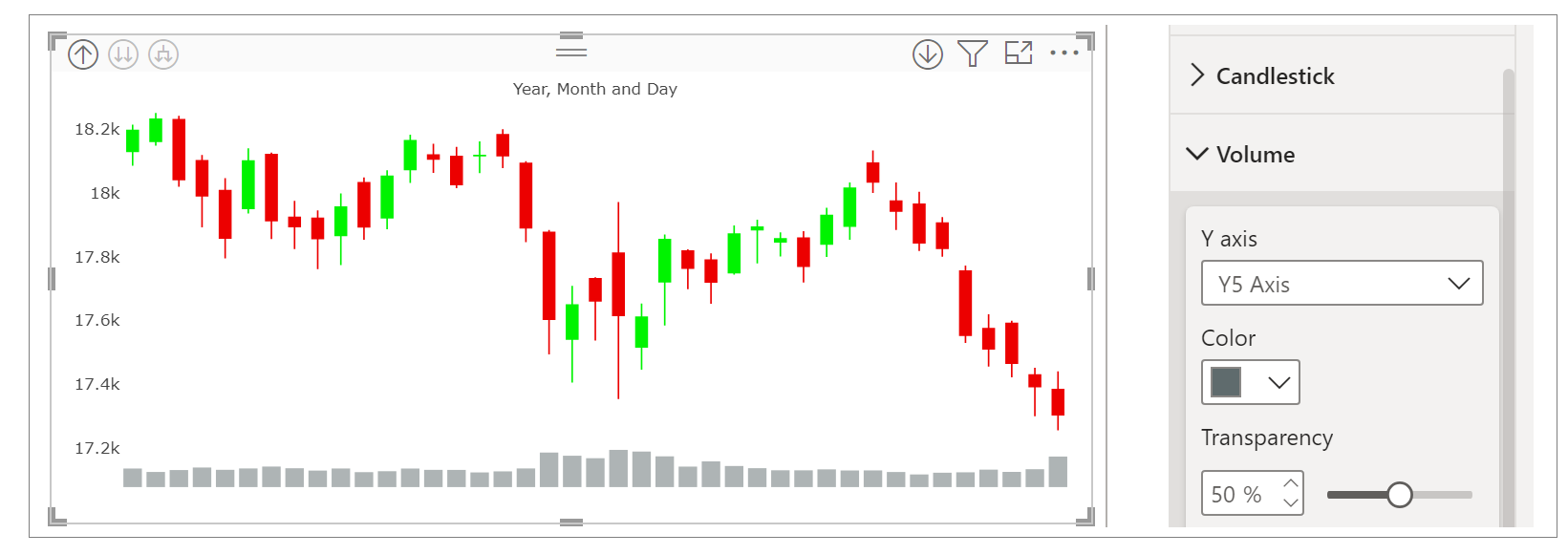
h. Volume Properties – Here you can customize the properties for volume like axis, color and transparency.
Step 4 – Advance Features
a. Individual Y axis for each indicator - In format visual, under trend line section, you can set the y axis for that particular indicator so that they can be visible as per your choice. This can be done for all the other trend lines.
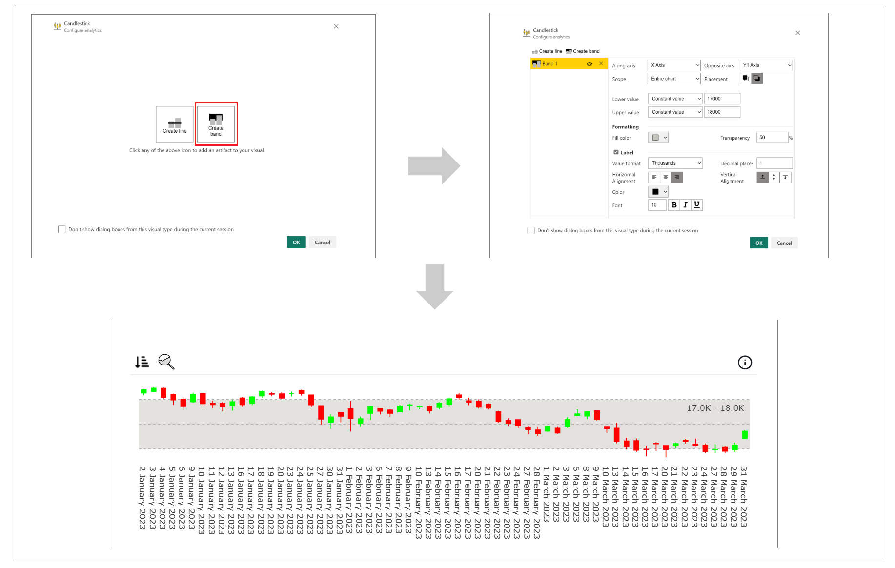
b. Bands - Bands can be created on the visual using analytics panel.
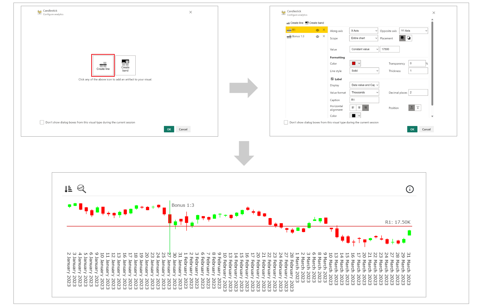
c. Horizontal and Vertical Lines - Horizontal or vertical lines can be created on the visual using analytics panel.
d. Sorting - PBIVizEdit offers great sorting flexibility for all its visuals. Below, we have shown how to create and apply custom sorting based on the fields you choose.
For more details, visit Sorting section.