Create Bar Chart with Multiple Target Lines for Power BI
This visual is created from advance visual Horizontal Bullet Chart
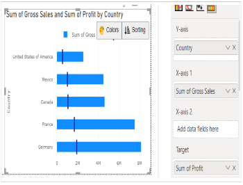
Steps to create Bar Chart with Multiple Target Lines from Horizontal Bullet Chart
Step 1. Map your data in the fields available
Here ‘Country’ is mapped under Y-axis. ‘Gross Sales’ and 'Profit' are mapped under X-axis 1 and Target respectively.
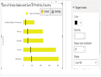
Step 2. Format your visual further
You can further format your visual like color, size, opacity of your series, labels, legend etc under the same tab ‘Format Visual’.