Create Dual Axis Scatter Chart for Power BI
Prerequisite:
- Sign up for PBIVizEdit
- Create sample data in CSV
Steps:
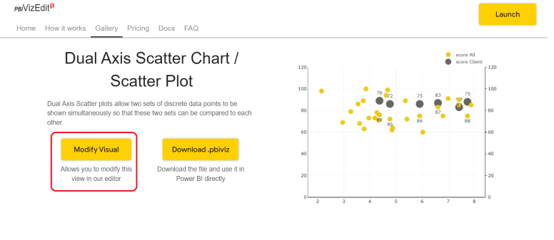
- Visit https://pbivizedit.com/gallery/dual-axis-scatter and click on modify visual.
- If you have already signed up in our tool you will directly go to the Dual Axis Scatter Chart editor.
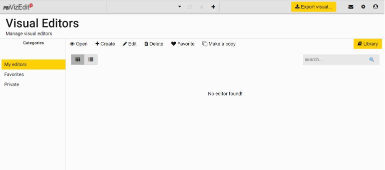
Else, you have to first register with our tool and after you log in you will first come across Visual Editors page.
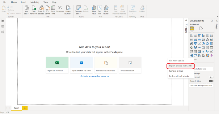
From Visual Editors page, you can go to library, choose the Dual Axis Scatter Chart visual and import the visual.
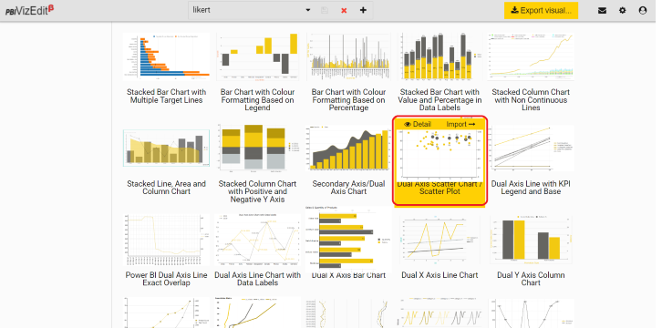 Once you click on import, you will be directed to the Dual Axis Scatter Chart editor.
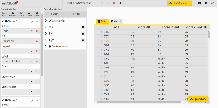
3. Upload your sample data (.csv files only) under Data tab using Upload csv button. For more details go to How to import data
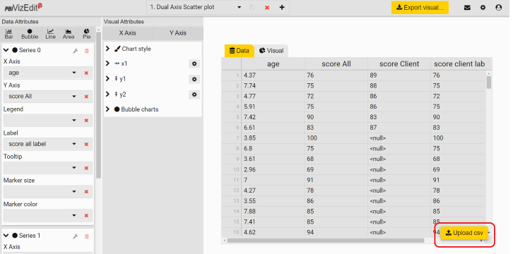
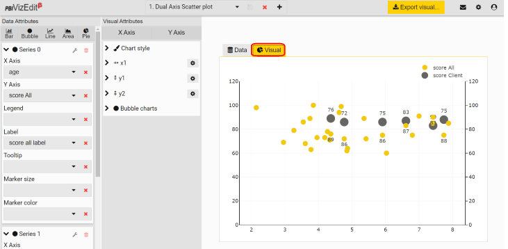
- Map your dimensions to axes available under Data Attributes.
e.g. – Based on the data taken in the sample
- Series 0 (Bubble): X Axis = age, Y Axis = score All, Label = score all label
- Series 1 (Bubble): X Axis = age, Y Axis = score Client, Label = score client label
For more details go to Data Attributes
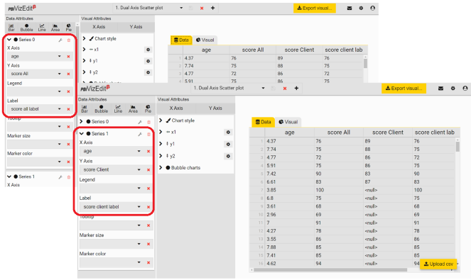
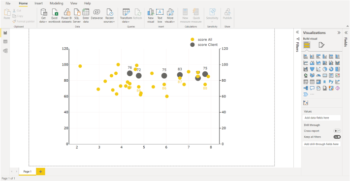
- You can check the visual after mapping under Visual tab.
-
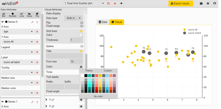
If you want to make changes in the visual attributes, you can make them under Visual Attributes section.
Few attributes that can be changed for Bubble/Scatter are :- Marker color
- Marker size
- Marker type
- Legends
- Labels and their colour, size, placement
- Tooltip etc.
To know more about visual attributes, check Visual Attributes section.
- Once you get your desired custom visual, click on Export visual button to export it.
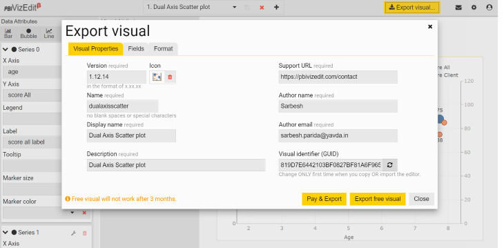
Update the visual properties and choose the properties you want Power BI formatting panel to display under Format tab. Once you have set the visual properties, fields and format, click on Export Visual button.
To know more about the visual properties, fields and format, check Export Visuals section.
Note - Free visuals will expire after 3 months from the day of export. If you want to use the visual for a longer period, we would suggest you to buy the visual.
- After exporting, import the .pbivizfile into the Power BI and use them in your dashboards.