Create Advanced Donut and Pie Chart for Power BI
Step 1 – Get the visual
You can get the visual from our website, Microsoft AppSource or Power BI desktop/web.
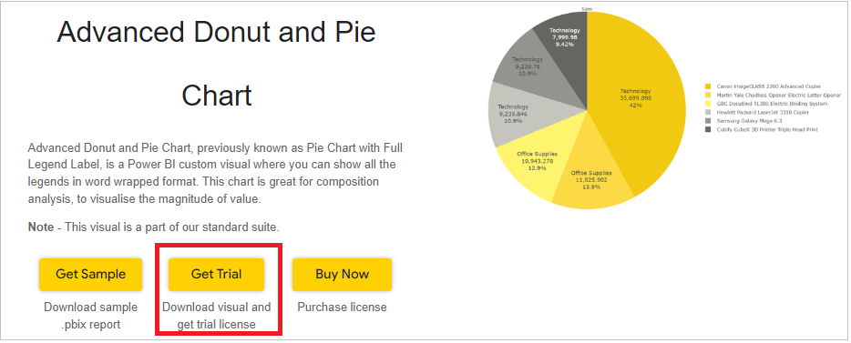
a. Website - Go to the visual page and click on ‘Get Trial’ button. You will be redirected to the pricing page where you will provide your email id and click on the ‘Download Visual’ button.
You will receive a mail which will contain the link to download .pbiviz file and a free trial license.
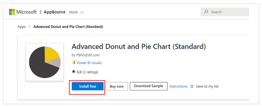
b. Microsoft AppSource – Click on the link and click on ‘Install Free’ button to download the .pbiviz file.
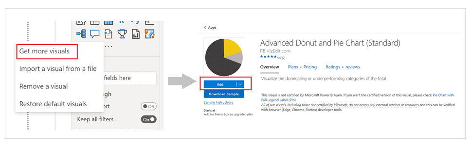
c. Power BI Desktop/Web – From Power BI desktop/web, click on three dots besides native icons and click on Get more visuals. Then type the visual name and click on ‘Add’ button.
Step 2 – Map your data in the fields available
After importing the visual in Power BI, map data in the given fields. Here we have mapped ‘Segment’ in Category, ‘Sales’ in Value and ‘Profit’ in Color by.
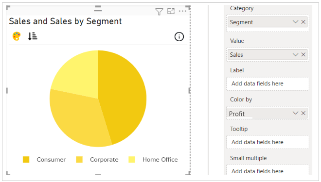
In case you want to show labels or tooltip of some other data in the visual, you can map that data under ‘Label’ or ‘Tooltip’ field respectively.
Step 3 – Format your visual further
a. License Details - If you want to check how your visual works in other Power BI platforms besides Power BI desktop, you have to fill License Details section.
To know more about License Details section, click here.
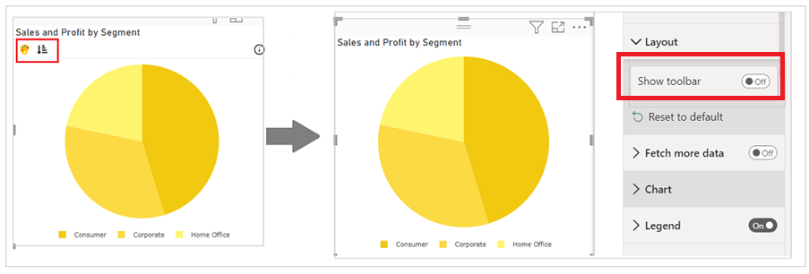
b. Layout Section – In case you don’t want to see the Conditional Color Formatting and Sorting icons present on the top left of the visual. You can switch off the Show Toolbar button.
c. Chart and Legend Section - To know more about these sections, please click the below links
d. Small multiple – If you have already mapped ‘Small multiples’ field with your data based on which you want to split your visuals into small visuals, then this section is used for formatting the small multiple visuals further.
To know more about this section's formatting, go to small multiple section.
e. Pie section – Besides the basic properties like transparency, rotation, slice border thickness and color, data labels customization, we have some advance properties like
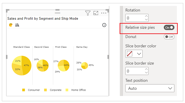
i. Relative size pies - This property can be used if you have mapped the ‘Small multiples’ field. When you enable this section, the small multiple pies will be shown in relative size determined by total.
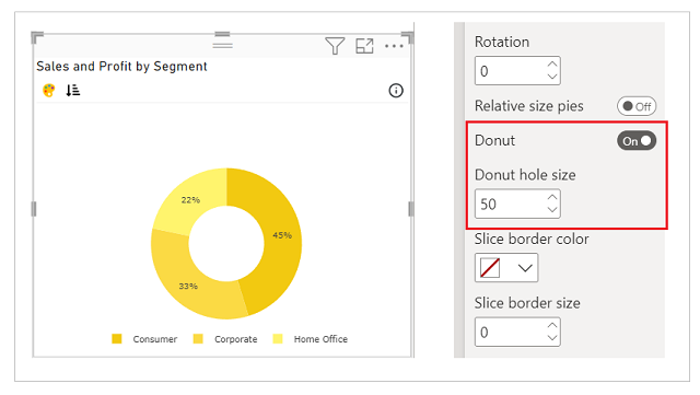
ii. Donut – If you want to convert your pie into donut, switch on the ‘Donut’ button. You can set the Donut hole size based on your requirement. By default, the Donut hole size is 50%.
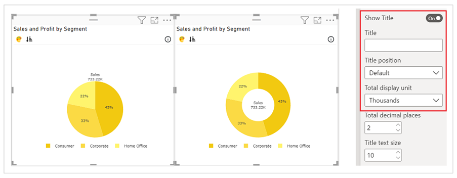
iii. Show Title – By enabling ‘Show Title’ button, if you want to show the total along with the title in the visual. In case of pie, the total will be show on the top of the pie and in case of donut, it will be shown in the middle of the donut.
Please click here, to know more about all the properties available under the Pie section.
Step 4 – Advance Feature (Conditional Color Formatting and Sorting)
a. Conditional Color Formatting - You can color the pie slices based on data fields and rules. Gradient coloring is not available in pie. You may learn more about conditional color formatting by visiting the Conditional Color Formatting section.
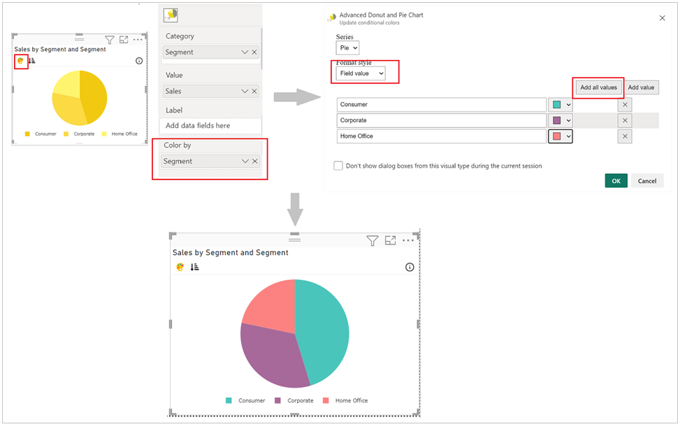
Map the data based on which you want to color them. Click on ‘Conditional Color’ icon on the top left side.
Under Format Style select Field value. Click on Add all values and you can now change the color of slice based on the mapped data.
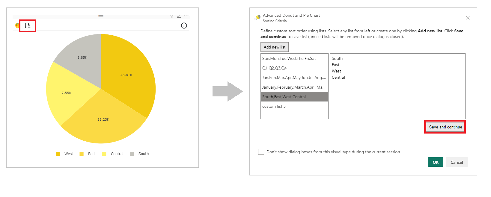
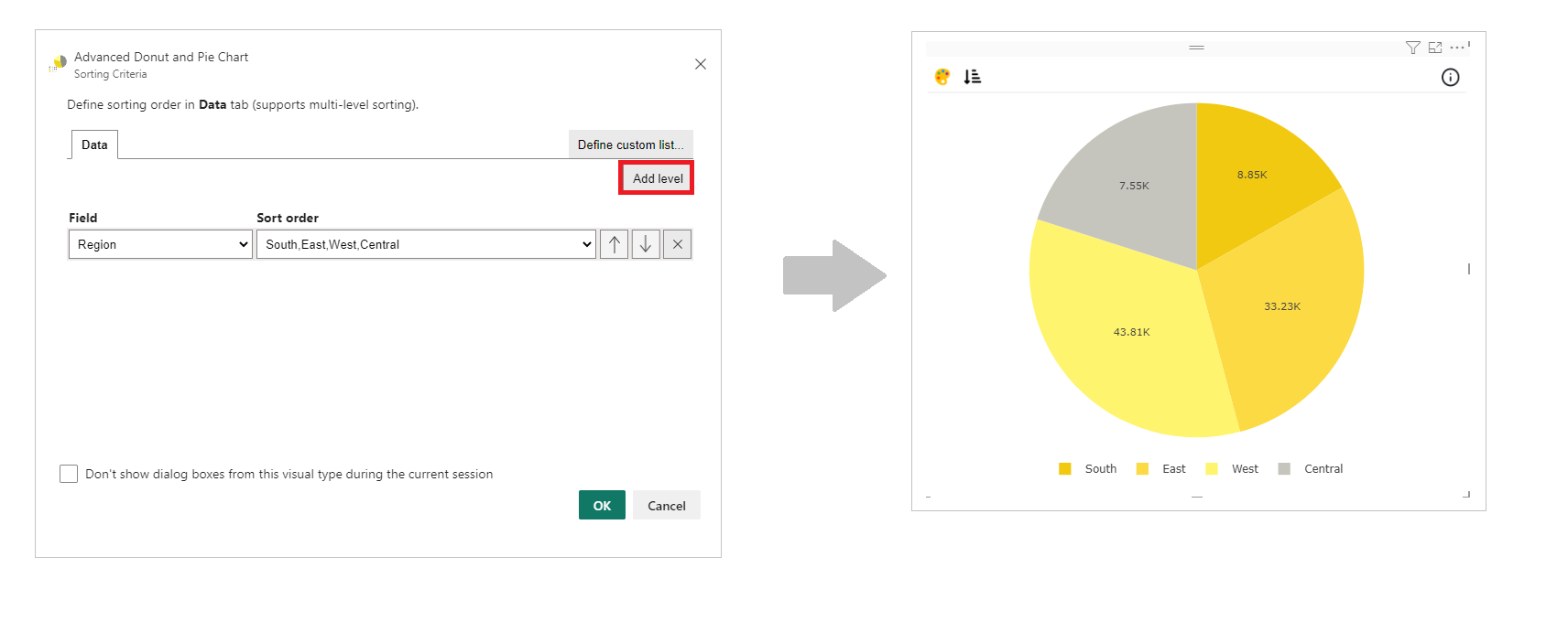
b. Sorting - PBIVizEdit offers great sorting flexibility for all its visuals. Below, we have shown how to create and apply custom sorting based on the fields you choose.
For more details, visit Sorting section.