Create Dual X-axis Bar Chart for Power BI
Step 1 – Get the visual
You can get the visual from our website, Microsoft AppSource or Power BI desktop/web.
a. Website - Go to the visual page and click on ‘Get Trial’ button. You will be redirected to the pricing page where you will provide your email id and click on the ‘Download Visual’ button.
You will receive a mail which will contain the link to download .pbiviz file and a free trial license.

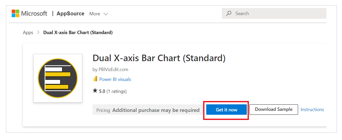
b. Microsoft AppSource – Click on the link and click on ‘Install Free’ button to download the .pbiviz file.
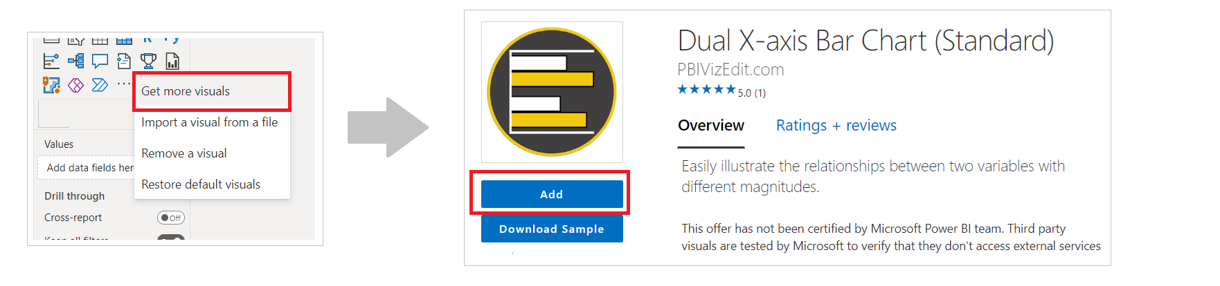
c. Power BI Desktop/Web – From Power BI desktop/web, click on three dots besides native icons and click on Get more visuals. Then type the visual name and click on ‘Add’ button.
Step 2 – Map your data in the fields available
After importing the visual in Power BI, map data in the given fields. Here we have mapped ‘Region’ in Y-axis, ‘Sales’ in X-axis 1 and ‘Quantity’ in X-axis 2.
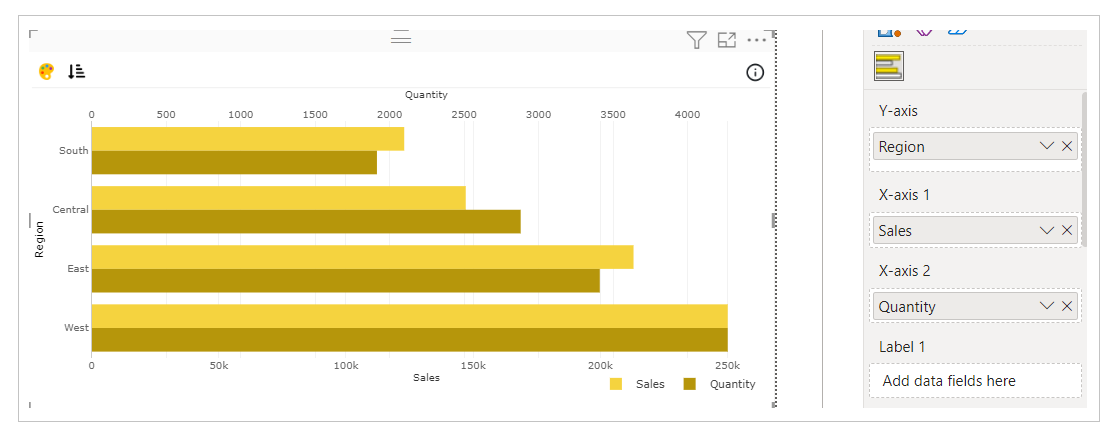
In case you want to show labels or tooltip of some other data in the visual, you can map that data under ‘Label’ or ‘Tooltip’ field respectively.
Step 3 – Format your visual further
a. License Details - If you want to check how your visual works in other Power BI platforms besides Power BI desktop, you have to fill License Details section.
To know more about License Details section, click here.
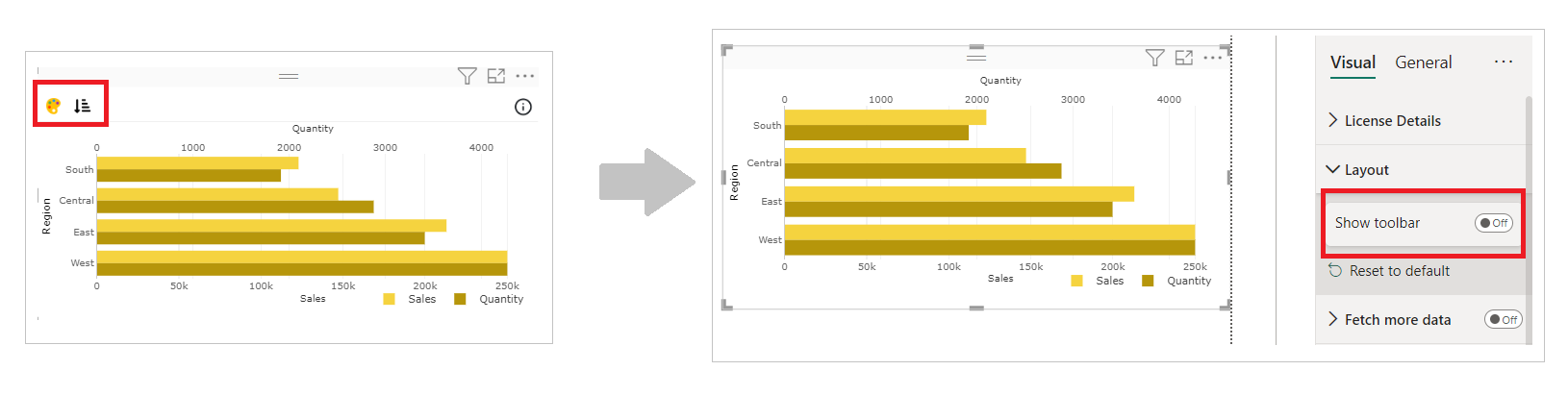
b. Layout Section – In case you don’t want to see the Conditional Color Formatting and Sorting icons present on the top left of the visual. You can switch off the Show Toolbar button.
c. Chart and Legend Section - To know more about these sections, please click the below links
d. X/Y Axis – You can format the properties of axes like type, color, title, labels etc.
For more details visit Axis section.
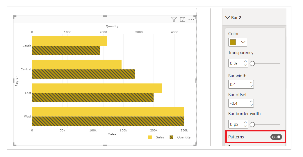
e. Bar Section – Under Bar section, you can select the color of the bar, opacity/transparency, bar width and border. You also have some more features like patterns, bar offset in addition to that.
i. Patterns - If you switch on Patterns, patterns will appear on the bar where you can customize its pattern type, size, color and opacity/transparency
For example, below we have showcased how to switch on patterns.
Note - You can add patterns to both your bars.
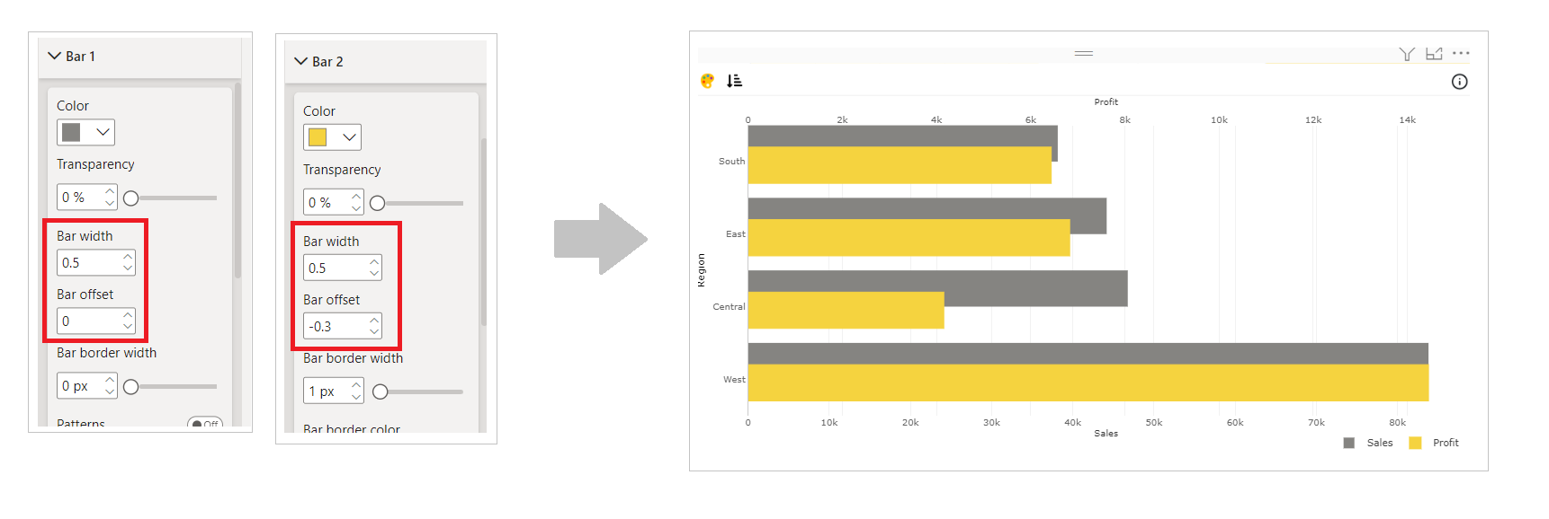
ii. Bar offset – This property is used when you want to change the position of one bar with respect to the other. For example below, we have created Overlapping Bar Chart from Clustered Bar Chart by setting the bar offset in both Bar sections.
If you want to know more about all the properties available under Bar section, refer this page.
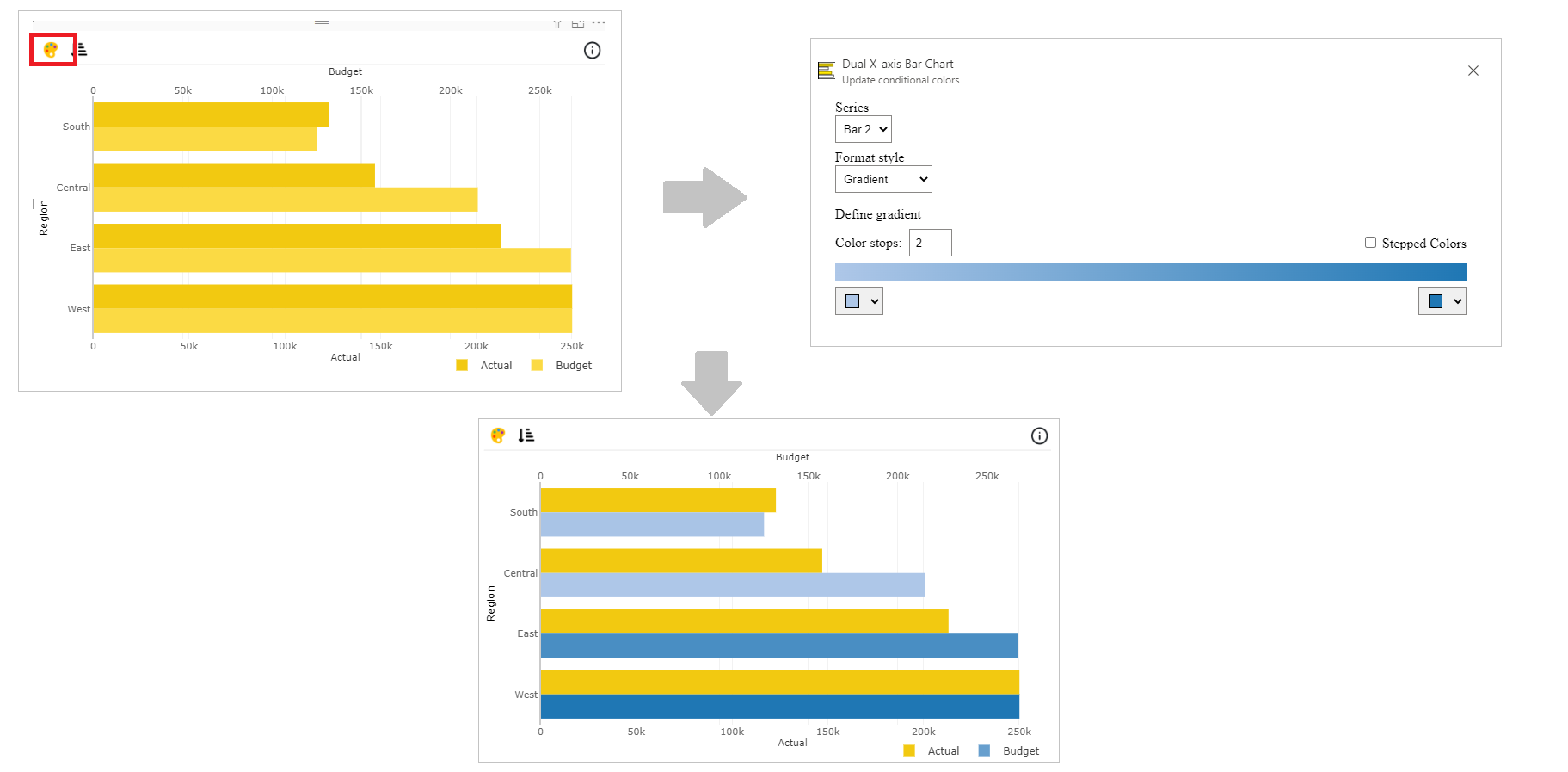
Step 4 – Advance Feature (Conditional Color Formatting and Sorting)
a. Conditional Color Formatting - You can color the bar based on data fields, rules or gradient. You can use Conditional Color Formatting documentation to learn more about this section.
Map the data based on which you want to color them. Click on ‘Conditional Color’ icon on the top left side.
Under Format Style select Gradient. Click on Color stops and you can now change the color of bar based on minimum and maximum value on the mapped data.
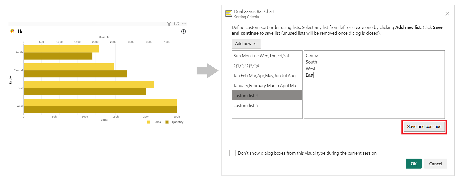
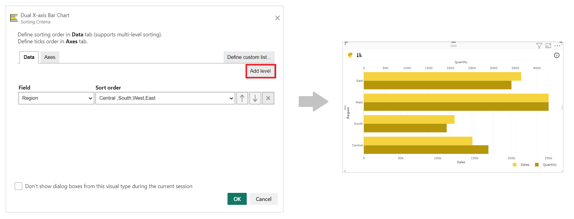
b. Sorting - PBIVizEdit offers great sorting flexibility for all its visuals. Below, we have shown how to create and apply custom sorting based on the fields you choose.
For more details, visit Sorting section.