Create Stacked Vertical Funnel Chart for Power BI
Step 1 – Get the visual
You can get the visual from our website, Microsoft AppSource or Power BI desktop/web.
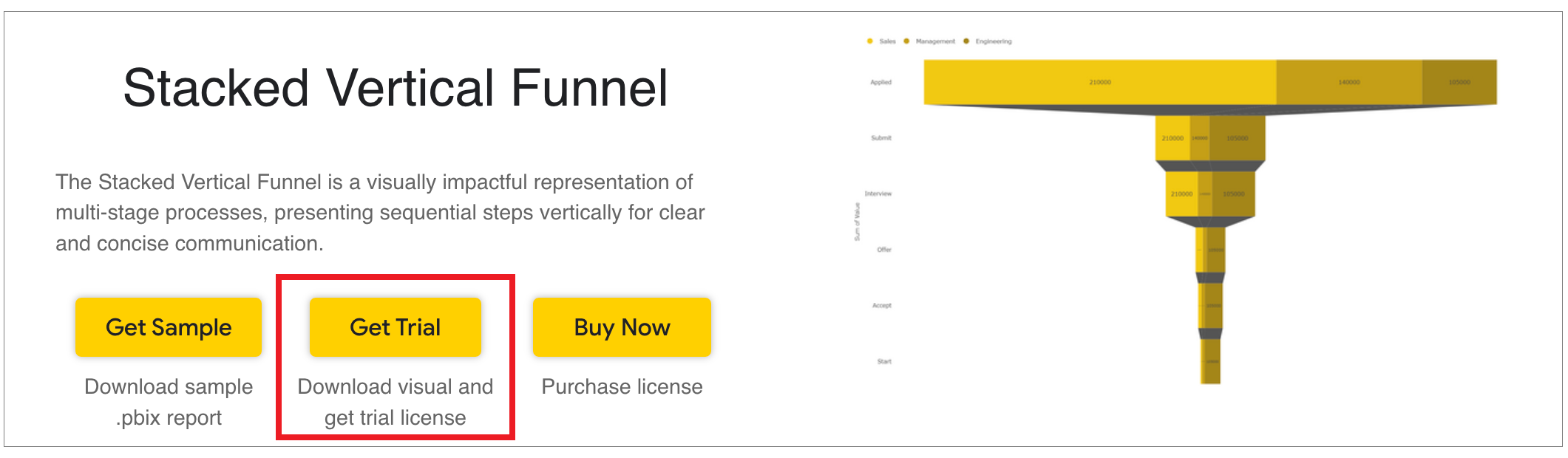
a. Website - Go to the visual page and click on ‘Get Trial’ button. You will be redirected to the pricing page where you will provide your email id and click on the ‘Download Visual’ button.
You will receive a mail which will contain the link to download .pbiviz file and a free trial license.
Step 2 – Map your data in the fields available
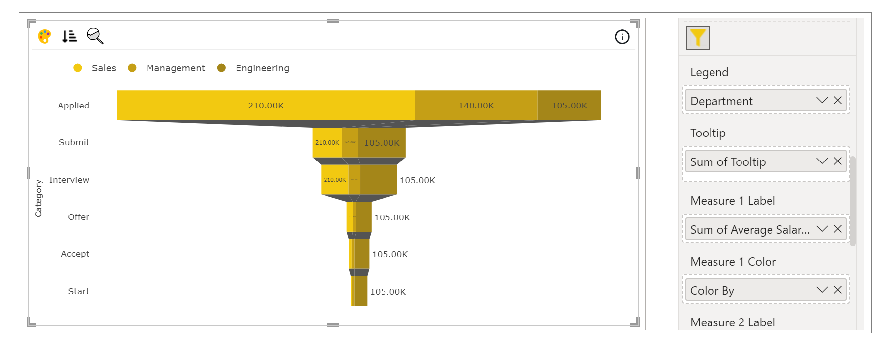
After importing the visual in Power BI, map data in the given fields. Here we have mapped ‘Category’ in Category, ‘Sum of Value’ in Measure 1, ‘Department’ in Legend, ‘Sum of Average Salary’ in Measure 1 Label. We can have up to total five Measures which will get stacked.
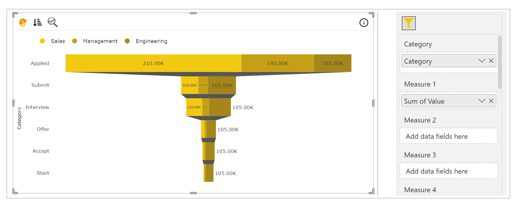
Each Measure can be mapped to the corresponding label and color. Tooltip and small multiple can be mapped as well.
Step 3 – Format your visual further
a. License Details - If you want to check how your visual works in other Power BI platforms besides Power BI desktop, you have to fill License Details section.
To know more about License Details section, click here.
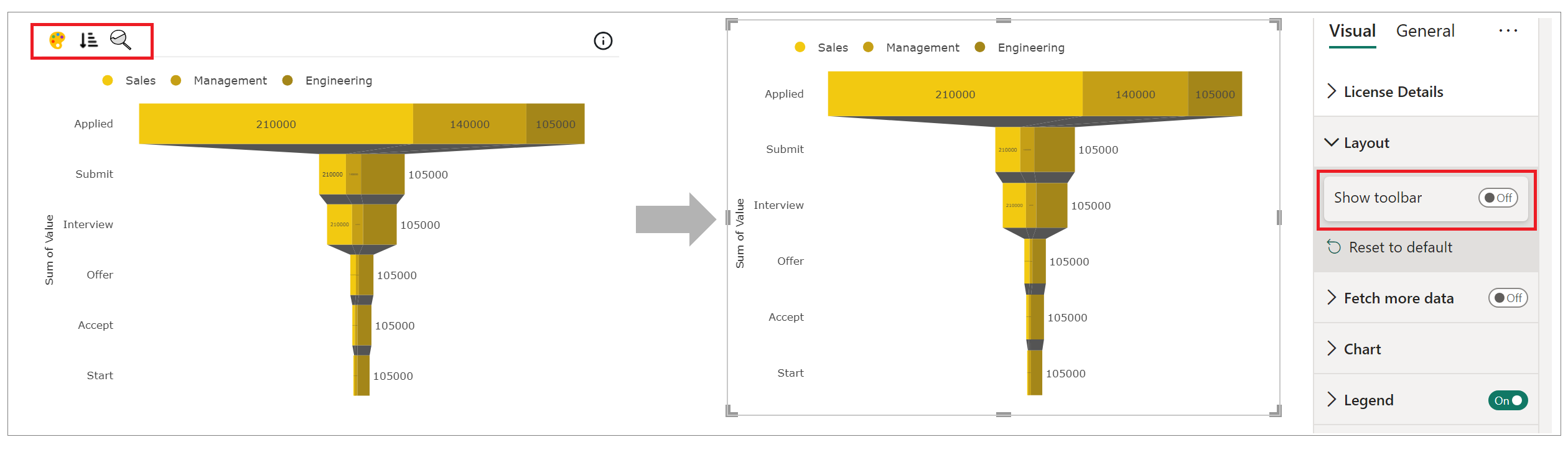
b. Layout Section – In case you don’t want to see the Conditional Color Formatting, Sorting and Analytics icons present on the top left of the visual. You can switch off the Show Toolbar button.
c. Chart and Legend Section - To know more about these sections, please click the below links
d. Y Axis – You can format the Y Axis under this section. You can choose the type of the axis, axis color, axis label formatting and many more.
For more details visit Axis section.
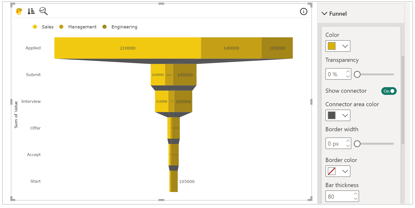
e. Funnel Section – Under Funnel section, you have all the properties through which you can configure the whole chart like color, transparency, show/hide connector, color of connector area, border width and color, bar thickness, etc.
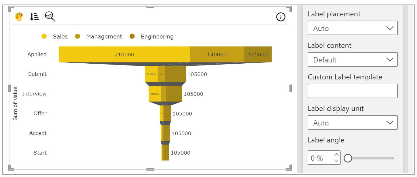
i. Label Properties – Here you can customize the label placement, label content, custom label template, label display unit, label angle, etc.
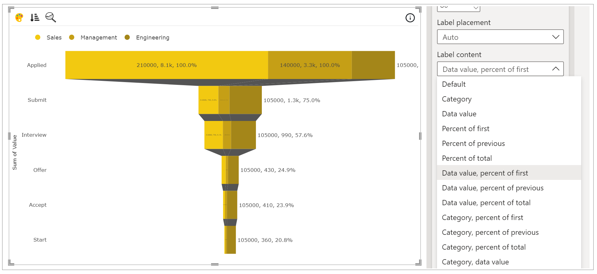
You can choose various label content, we have covered many types of label content such as Percent of total, Percent of previous, etc. Percent of previous means that the width of current bar is of how much percent as compared to previous bar. Similarly, percent of total compares to the total width of all bars and percent of first compares to the width of first bar. Below is the demonstration of label when label content is chosen as Data value, percent of first.
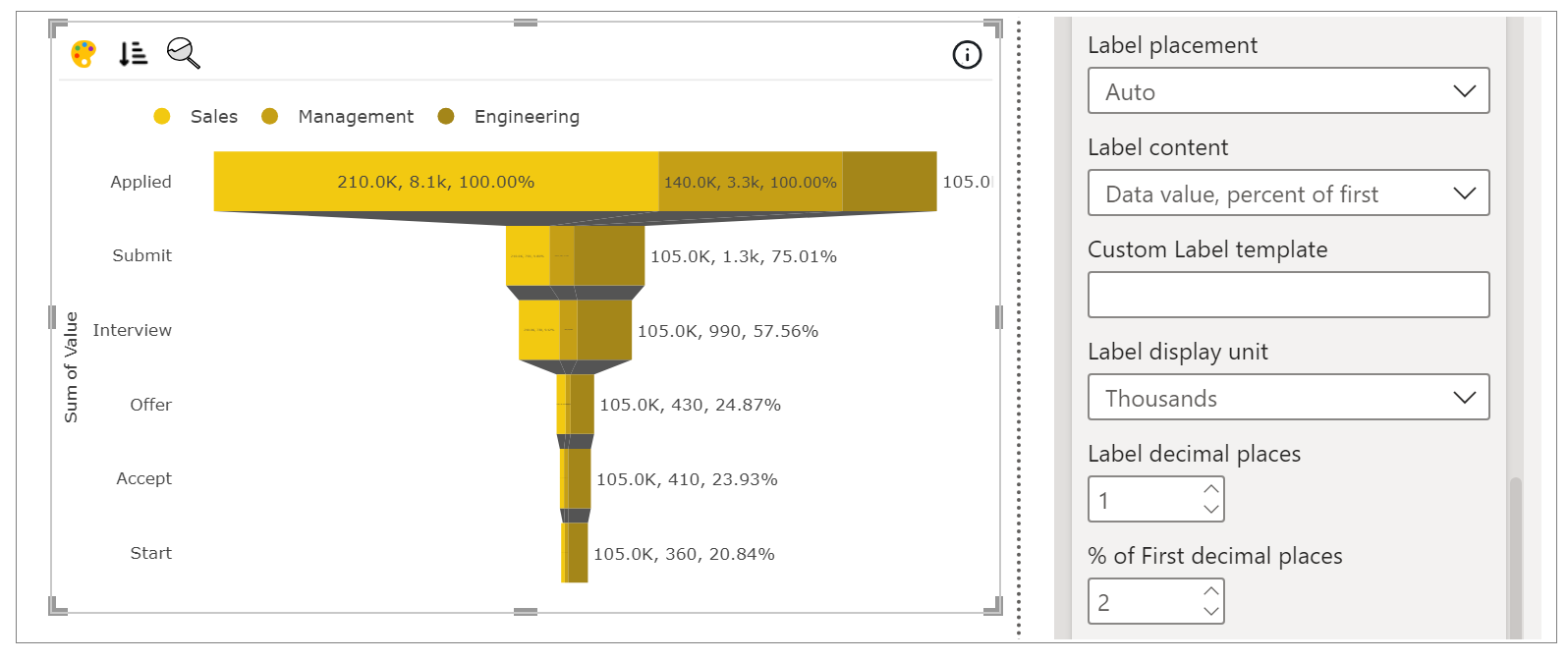
In Label display unit, you can select type of display unit like Thousands, Millions, etc. and also can select the level of precision for them.
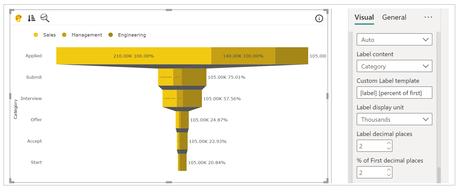
Custom Label template can be set which have six options that can be added in square bracket (category, data value, label, percent of total, percent of previous, percent of first). Text inside square bracket is case insensitive. Custom label template have priority above label content.
Below, we have added custom label template as [label] and [percent of first] and also set their decimal places.
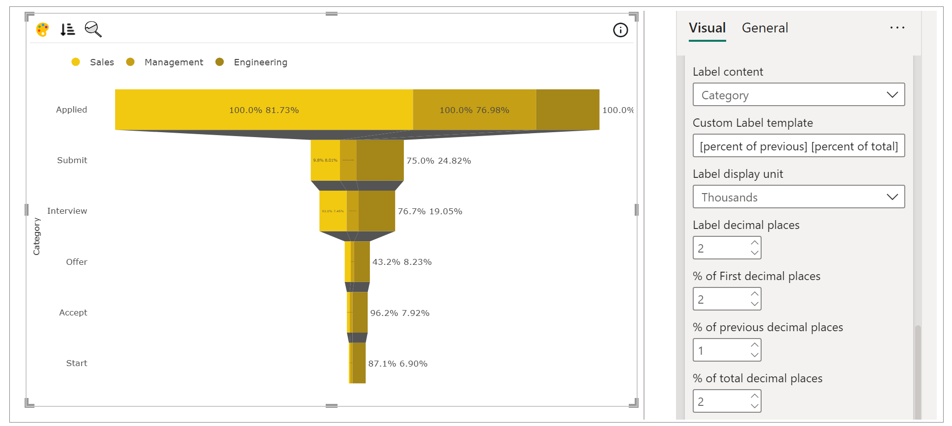
Below, we have added custom label template as [percent of previous] and [percent of total] and also set their decimal places.
Few more properties are there for labels like angle, color, size and Bold, Italic, Underline.

Step 4 – Advance Feature (Conditional Color Formatting and Sorting)
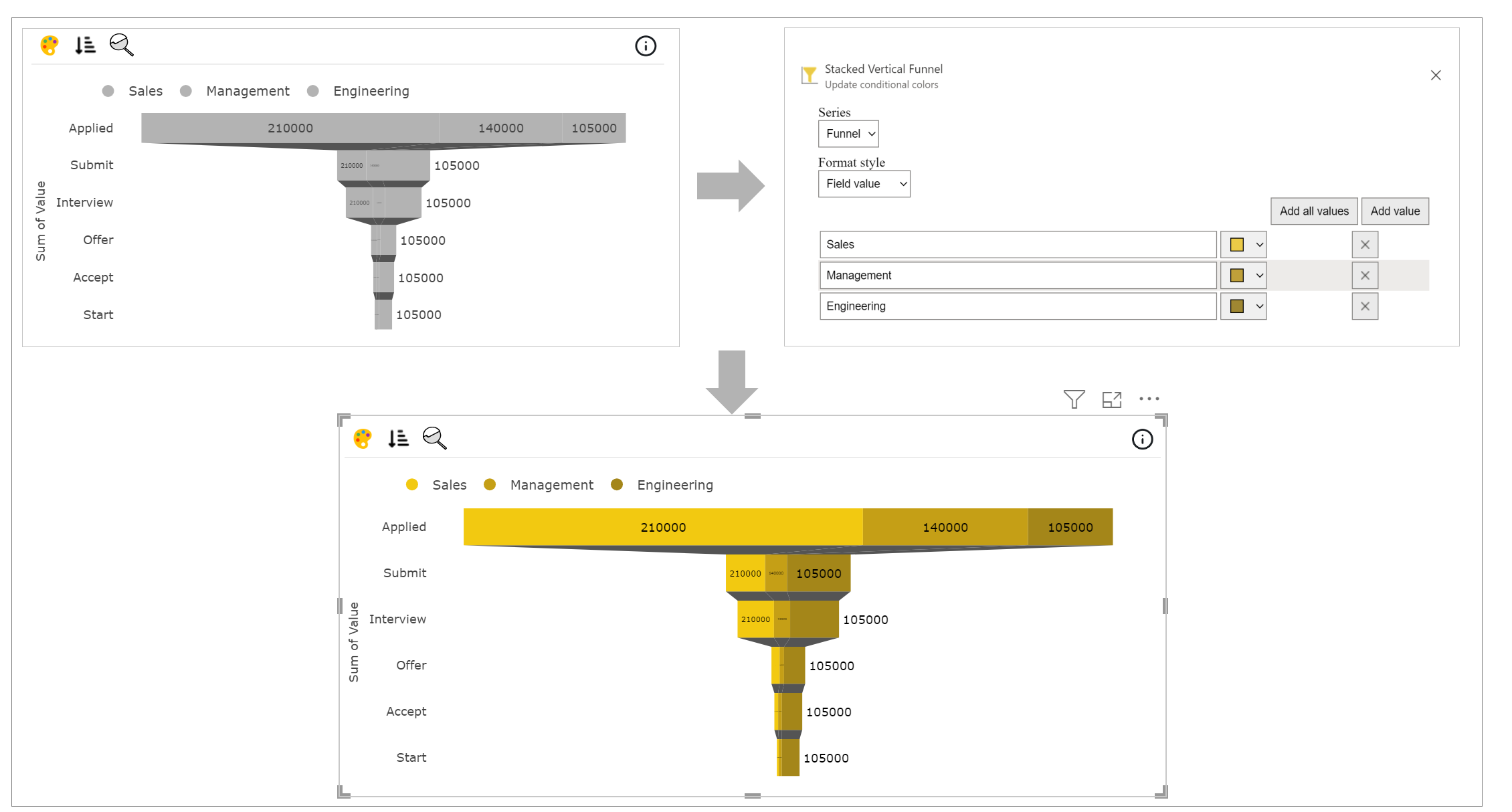
a. Conditional Color Formatting - You can color the funnel based on data fields and rules. You can use Conditional Color Formatting documentation to learn more about this section.
Map the data based on which you want to color them. Click on ‘Conditional Color’ icon on the top left side.
Under Format Style select Field value. Click on Add value and you can now change the color of funnels based on mapped data.
b. Sorting - PBIVizEdit offers great sorting flexibility for all its visuals. Below, we have shown how to create and apply custom sorting based on the fields you choose.
For more details, visit Sorting section.