Create Side By Side Bar Chart for Power BI
Step 1 – Get the visual
You can get the visual from our website, Microsoft AppSource or Power BI desktop/web.
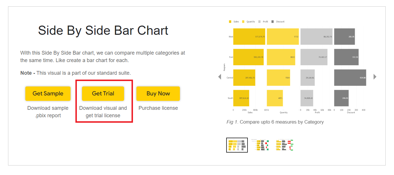
a. Website - Go to the visual page and click on ‘Get Trial’ button. You will be redirected to the pricing page where you will provide your email id and click on the ‘Download Visual’ button.
You will receive a mail which will contain the link to download .pbiviz file and a free trial license.
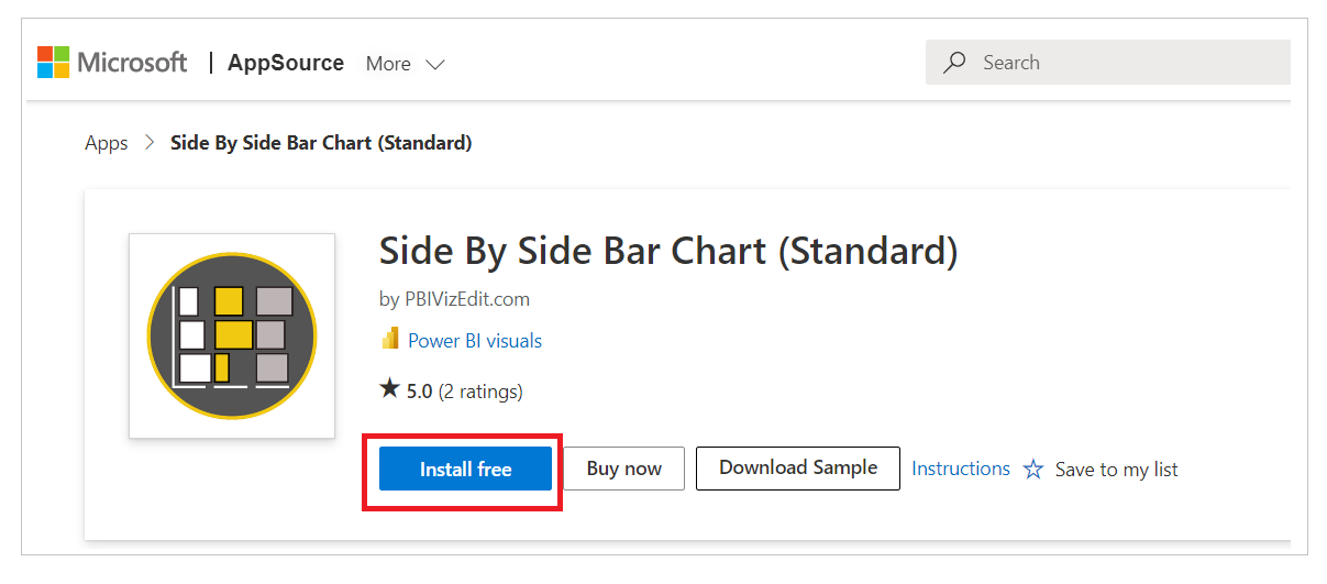
b. Microsoft AppSource – Click on the link and click on ‘Install Free’ button to download the .pbiviz file.
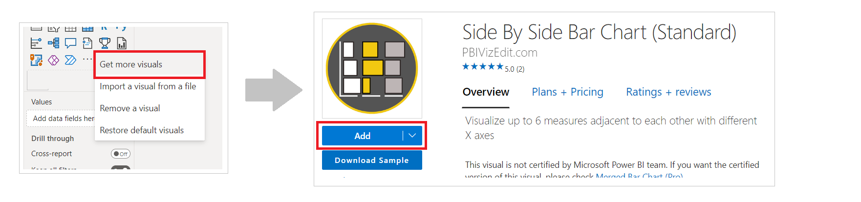
c. Power BI Desktop/Web – From Power BI desktop/web, click on three dots besides native icons and click on Get more visuals. Then type the visual name and click on ‘Add’ button.
Step 2 – Map your data in the fields available
After importing the visual in Power BI, map data in the given fields. Here we have mapped ‘Region’ in Axis, ‘Sales’ in Value 1, ‘Quantity’ in Value 2, ‘Profit’ in Value 3 and ‘Discount’ in Value 4.
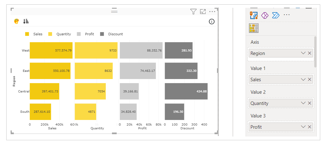
In case you want to show tooltip of some other data in the visual, you can map that data under ‘Tooltip’ field.
Step 3 – Format your visual further
a. License Details - If you want to check how your visual works in other Power BI platforms besides Power BI desktop, you have to fill License Details section.
To know more about License Details section, click here.
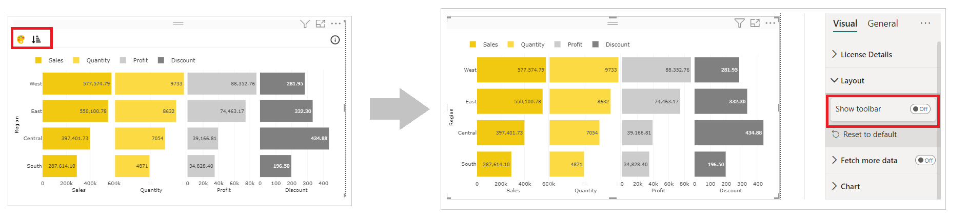
b. Layout Section – In case you don’t want to see the Conditional Color Formatting and Sorting icons present on the top left of the visual. You can switch off the Show Toolbar button.
c. Chart and Legend Section - To know more about these sections, please click the below links
d. X/Y Axis – If you want to format the Axes, you can choose the type of Axis, its position, color and much.
For more details visit Axis section.
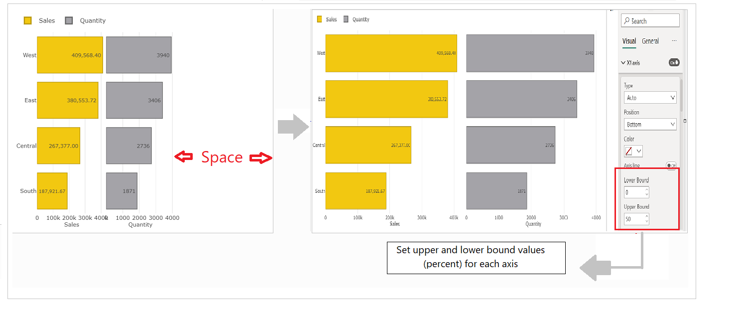
Note - In Side-by-side bar, you can compare up to six measures side by side. When you map 2–4 measures in Side-by-Side bar chart, the bars are created based on Upper and Lower Bound set for 6 X-axes. This leaves a blank space towards the right in the canvas.
To evenly distribute each section of bars, select the Upper and Lower Bound for each X axis.
Like in the example below, as there are two measures mapped, we have set 0–50 (%) for the X1 axis and 51–100 (%) for the X2 axis.
e. Value section – Under Value section, you can select the color of the bar, opacity/transparency, bar border width. Along with that you have some additional features like label placement etc.
If you want to know more about all the properties available under Bar section, please refer this page.
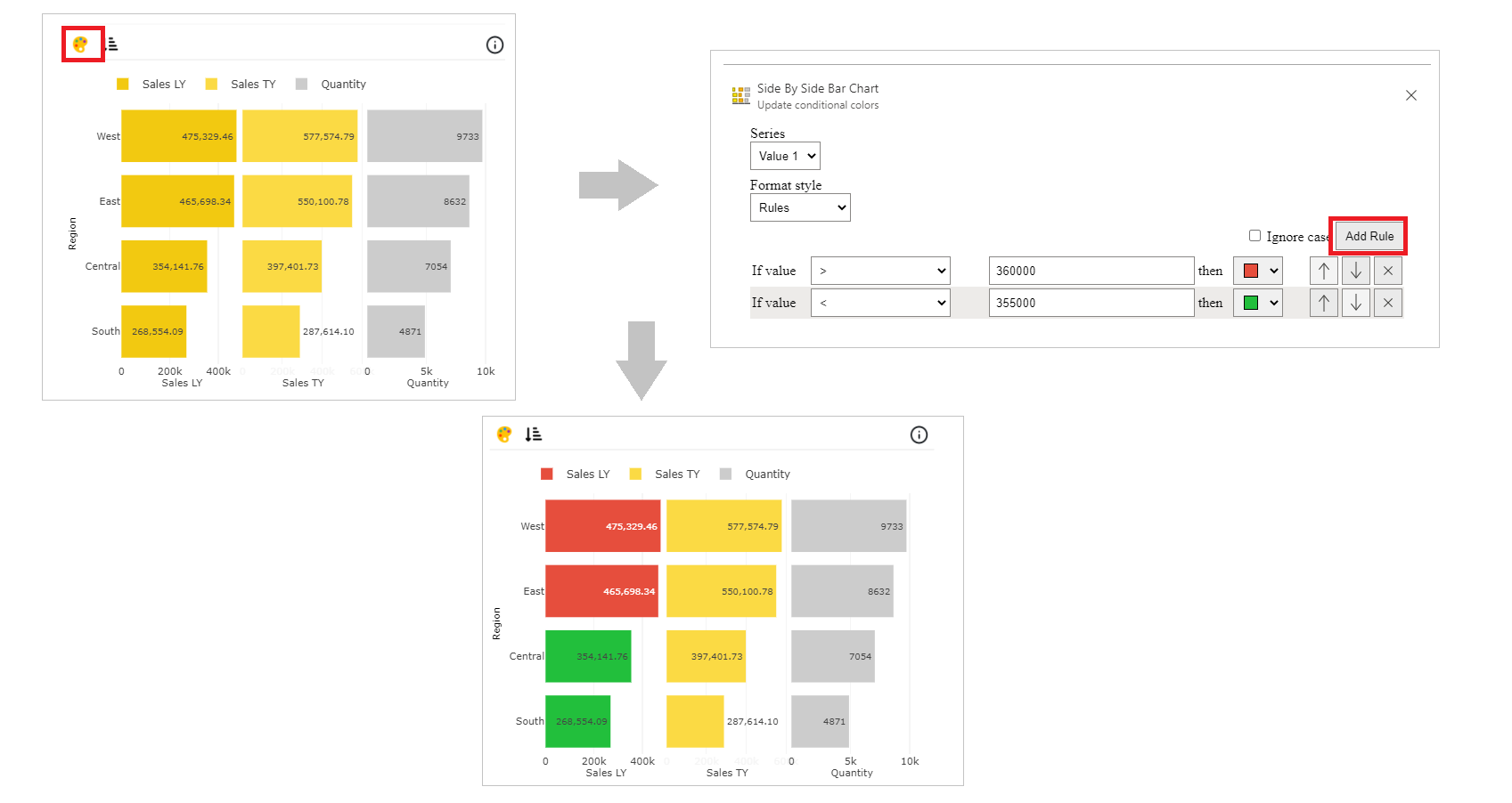
Step 4 – Advance Feature (Conditional Color Formatting and Sorting)
a. Conditional Color Formatting - You can color the bar based on data fields, rules or gradient.
You may learn more about conditional color formatting by visiting the Conditional Color Formatting section.
Map the data based on which you want to color them. Click on ‘Conditional Color’ icon on the top left side.
Under Format Style select Rules. Click on Add Rule and you can now change the color of bars based on mapped data.
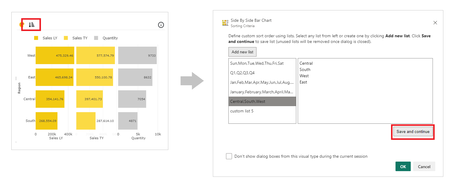
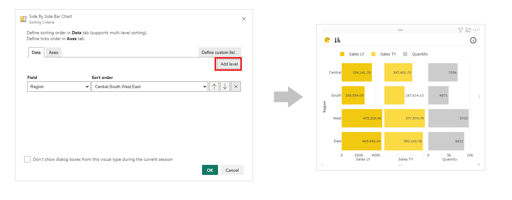
b. Sorting - PBIVizEdit offers great sorting flexibility for all its visuals. Below, we have shown how to create and apply custom sorting based on the fields you choose.
For more details, visit Sorting section.